Tag Archives: wordpress

Is WordPress A Thankless Community?

Over the past few weeks, I’ve noticed a disturbing trend. Many of the plugin authors I have spoken with throughout the community tell me that very rarely do they ever get a donation let alone a Thank You for releasing their work to the public. Based on the plugin authors feedback, end users demand more features, demand better support, and in the end, have this feeling of entitlement even if the plugin is available without a price tag. The reality is, that for a freely available plugin, you’re not entitled to anything. I don’t know about you, but I certainly would not like to be part of a community that is known as thankless.

via Is WordPress A Thankless Community? | Weblog Tools Collection.

I would err on the side of “yes, WordPress is a thankless community” with this one, but realistically, it could easily swing both ways.

I certainly don’t donate (but maybe I should), but I do try and help out exposure by blogging about awesome plugins/themes that I use.

To all those I haven’t mentioned, thanks. Thanks for all the hard work you’ve put in so that I didn’t have to. 🙂

New theme, huh? Looks like [redacted].

So… Hopefully you’ve noticed the new theme by now.

If you haven’t, I have no idea what you’re doing here at this very second. You do realise that you’re on the internet, yeah? :S

I hated the old theme for a number of reasons –

  1. Horribly commented code.
    One of my pet peeves has to be programmers (web or otherwise) who don’t follow good programming practices. In Satiorii’s case, it wasn’t just lack of comments – just a lack of readability in general. Ugh.
  2. Sidebars at the BOTTOM of the page.
    Uh, hello? Sidebars at the BOTTOM of the page? That’s just not cool – it might have been had you included links to jump down quickly, but in any case, sidebar widgets looked like they had been hacked together, and ugly as hell – misalignment, horrible formatting, etc.. 🙁
  3. No search.
    See 2. Because search was so horrible, it wasn’t even worth using.

The previous theme – you could clearly tell it wasn’t designed to be modified. Plus it didn’t seem to be made by someone who understood how wordpress works – at least, not in the traditional blogging sense.

However, it wasn’t all bad – I chose to look past it’s shortcomings to focus on the good, because that’s the kind of guy I am. 😀

I did like elements of it, otherwise it wouldn’t have stayed as long as it did – particularly the awesome header links that showed off my pages:
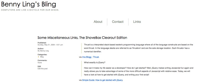
They’re quite nice – I love it how it placed those things front and centre, exactly where they should be.

Another thing I quite liked was the awesome typography of the blog name and sub-heading – under OSX, it just looked awesome. However, under Windows it was a different story – it seemed to be borked for most people anyway (or maybe just Chris). Maybe it’s how the two OSs render fonts, or how the anti-aliasing was waaaaay nicer on OSX, or something.

Anyway, I hope you like the new theme. It’s (the somewhat popular) Grid Focus, by Derek of 5thirtyone.com – if you have a chance, head over to that site to check out more themes. I’m even thinking of using The Unstandard theme for the Radi8 website… Oops, probably shouldn’t have leaked that 😉

I won the FlashMint.com premium WordPress theme giveaway!

The final date has passed and the following people have won a FlashMint WordPress Template: Benny Ling, Simon | Teenius and Amanda. Congratulations to the winners!

via Giveaway contest – FlashMint.com Premium WordPress Themes.

So it turns out that I’ve won a free premium WordPress theme. Cool, yeah?

What isn’t so cool is that most of the designs suck. It’s not the designs themselves, it’s just that the design’s aren’t me. For a personal blog, that’s important.

What to do? If I do choose a theme and it’s not customisable to my own requirements, then I probably won’t use it. If I choose a theme and don’t decide to use it, well, there’s not a whole heap I can do about that either.

I’ll probably choose a theme just for the hell of it – and use it on another site I’m developing at the moment. Radi8’ers, this one’s for you. 😉

WordPress Counter Strike Theme

Counter Strike Theme

Free WordPress Counter Strike Web2.0 Theme Template, theme designed for first person shooting games blog. This is a fabulous theme, It has very interesting images, cool color scheme. Two columns and fixed width. This is an XHTML and CSS valid theme, tested properly on Firefox3, IE6 and IE7, works both well with WordPress 2.7 and older versions, and supports threaded comments coming with WordPress 2.7.

via Free WordPress Counter Strike Blog Web2.0 Theme Template » Free Web Templates and Themes.

I might install this for the lulz.

That’ll do, donkey. That’ll do.

Ugh.

Have I mentioned before how much I hate choosing new themes for my blog? Or for any website, for that matter…

It’s difficult because of three reasons:

  • It’s hard to find something that works for you. Being the admin of the blog, you know where it’s going. When you’re looking for a theme, you know exactly what you want – in the case of Benny Ling’s Bling, I wanted something that was simple but elegant – something that stood apart from the hundreds of other blogs out there.
  • Free is good. Unfortunately, being the poor student that I am, I don’t have much of a web budget – especially for things like WordPress themes. It’s like a wise man once said: “Pay peanuts, get monkeys”, as well as the age-old adage of “You get what you pay for”. Don’t get me wrong, though – I’d totally pay for a theme if I decided that it was going to work for me, assuming it is reasonably priced. US $50 is not my idea of reasonable.
  • Finding something that will require minimal tweaking is hard to do – especially when the theme is free to begin. It’s like the hardware and software problem – even though Microsoft make software that’s designed to work on every computer under the sun, sometimes it needs a little help. Apple, on the other hand, make both the hardware and the software – the result of which is that “it just works”.

With these three things in mind, I have managed to settle on Elegant Grunge, by Michael Tyson. I’ve had to compromise in some areas – while I haven’t given it a full test-run yet, I’m sure I’ll find something later on down the track that needs to be changed. So far so good, though – fingers crossed it stays that way.

UPDATE: No, I haven’t settled on Elegant Grunge. Instead, I’ve settled on Sator-ii, by Felipe Lavín. It’s got some pretty horrible CSS (no comments, c’mon), and has some funny spelling mistakes – but that’s okay, because I don’t think the creator is a native english speaker.

You may think I’m missing out something here – why don’t I just make my own theme? Unfortunately, that’s easier said than done – I’d have no idea where to start with a WordPress theme, let alone make a good one… Sure, I can hack my way around a CSS stylesheet, and I can diagnose and fix any formatting/styling issues with WordPress, but apart from that… Time constraints mean making my own them just isn’t feasible at this point in time. One of these days I probably should, but I’ll leave it to the experts for now. 🙂