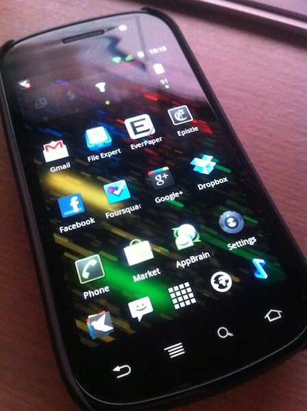
There’s this little blog called My Dinner With Android that received some media attention a few months or so ago, and it attempts to detail one iOS user’s journey with the Nexus S. This post is where I will attempt to do the same, with a few exceptions: his previous smartphone is an iPhone 3GS, my previous smartphone is an iPhone 4. He is from the US, I am from Australia. Everything else is fairly similar. For the sake of your sanity and length, this will be yet another two-parter — the first part, this part, will focus more on Android as something to live with every day, with a few comparisons to iOS and WP7 along the way. The second, more ranty part, will probably be about how much I hate Android and all of its crazy user interaction methods — either that, or a few more details on things I’ve said here, as well as more critical look at Android as a smartphone platform and an Apple iOS competitor.
Yes, I’ve done it again. Changed smartphone platforms, at least temporarily. After my experiments with WP7 I figured I had to give Android another go, a more serious one this time. Like I said, Android is my poison of choice this time around, and the Nexus S is the chalice from which I drink. I realised my previous attempt at Android was little more than a ranting tirade about everything that was wrong about the platform, so this time around I’m going to take a more objective view.
First, the hardware. So, what is the Nexus S like? It’s alright. Not fantastic like the aluminium-and-glass of the iPhone 4, but still alright. Plastic feels somewhat cheap, but overall the whole kit is passable. The most defining feature of the Nexus S is that the front glass is curved – people have said that the inwardly-curved front glass fits better against the face when you’re on a call, and it does. Oh, and the screen is a little larger than what I’m normally used to, which, when combined with the hardware navigation keys (back, menu, home) means that apps have a little more breathing room.
