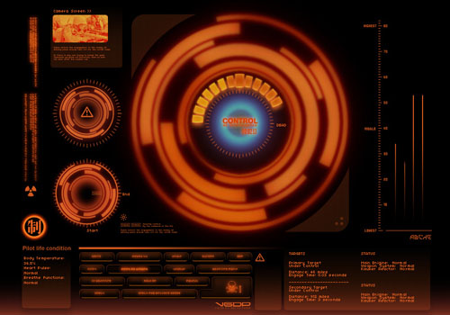
via Sleek Interface Designs from DeviantART.
Okay, I’ll admit it – being a Mac user, I usually prefer to having things that work, even if that means sacrificing a little bit of customisability here and there. Every so often though, I like to go all out with UI customisations and tweak every setting/interface I can.
I didn’t even realise it until just now, when I saw the two pics at the beginning of this post. For some reason, they reminded me of the dark old days when I used to used Windows ME machine with a little program called Musicmatch Jukebox, which was almost infinitely skinnable and could be made to look pretty similar to the screenshots above.
If I’m honest, it’s one of the things I miss about “the Apple experience” – the ability to customise UIs to however you want. Then again, I’m kinda glad – Apple gear (usually, haha) lets you get stuff done, without worrying about all of that kind of stuff. It’s probably one of the reasons it’s more user-friendly as well, but we wont’ go into that.
Yet, even after being a “true Mac user” for the past three years or so (PPC is so dead to me), I’m not ashamed to say I’ve relapsed once or twice. I jailbroke my iPhone 3G and installed a different font (which, interestingly, made it slightly less readable, but so much more enjoyable on the eyes), I’ve experimented with Enigma for Windows, and more recently, I’ve also considered changing the standard Mac UI scrollbars to something a little more, er, modern.
Bottom line? It’s not that I don’t like having control over how I think things should look – far and away, themes are great. However, it’s the time required to make everything “just right” that kinda puts me off – one of the main reasons I didn’t stick with Enigma was that as powerful as it was, I wasn’t really prepared to go diving into lots of customisation files for all the tweaks I needed to make, which is also one of the reasons why I haven’t tried GeekTool yet, either.
As I’ve said before – Linux is only free if your time is worthless, and that still holds true for (most) of these customisations, as well. Be content with what you have – experience has always told me there will always be a better version out there, but oh wait – did you just waste an hour trying to get it to work?
😉

