Logos are everywhere. Because of this, only a few can rise among the noise — and often it’s the more unique logos that are most memorable. Sometimes to be unique, you’ve also got to be weird. In this post, we showcase twenty lovably strange logos that work.
via 20 Weird Logos That Work (and Why They Do) – VECTORTUTS.
My favourite?
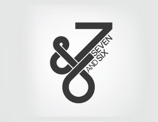
Seven and Six.
The geometric layout of the Seven and Six logo creates a groovy looking mark that also acts as the graphical alternative of the brand name. Using the numeric figures and the ampersand reinforce the complete worded variations.
Love the design. Wish I could be that designer-y.
