It’s been a while since I updated my homescreen.me profile, and with the official release of iOS 5 and needing something to post up on my blog, I figured now was as good a time as any… Here goes!
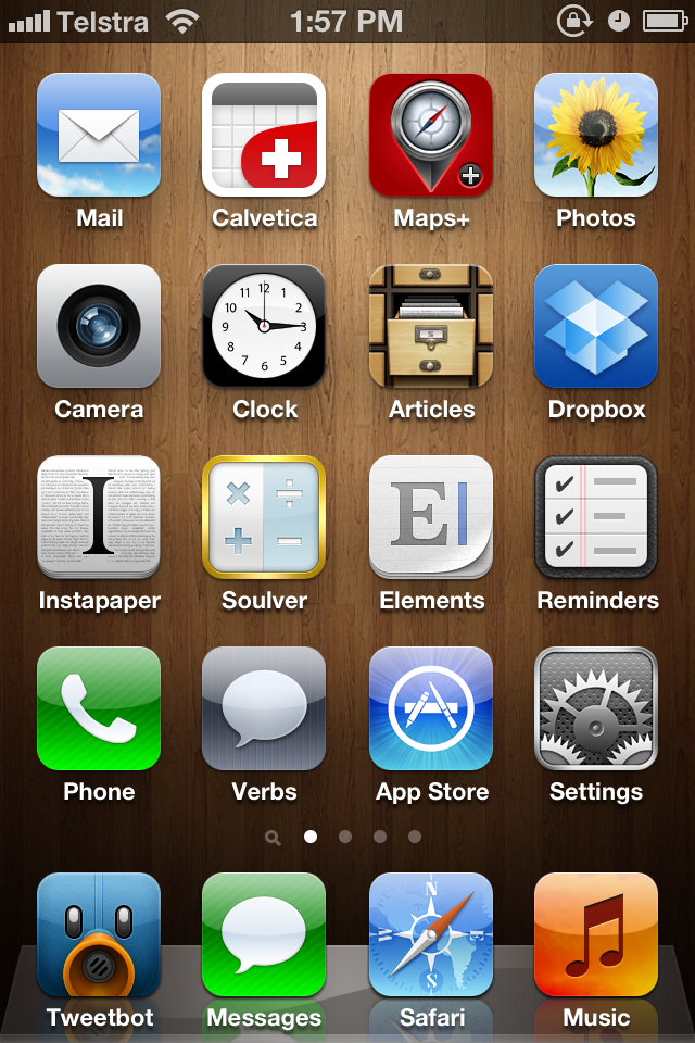
Like many Apple faithful my home screen is fairly similar to what Apple provide as the default – with a few important changes.
Three years of iOS ownership means quite a bit of customisation. My home screen is organised in a loose Ben Brooks configuration, with a few stock Apple apps, some fantastic replacements for a few of the stock Apple apps, and some other great apps that I’ve found over the years.
First row: Mail, Calvetica, Maps+, Photos
Calvetica is a very good Calendar replacement set in beautiful Helvetica. It’s changed quite a bit since the original release, but it’s still very fast, and very capable.
Maps+ is like the original Maps app with much more of a focus on the actual maps, and less UI chrome to boot, while still staying highly functional. Packing all the same features (and then some) as the stock Maps app while having a very minimalistic UI is a winner in my books.
Second row: Camera, Clock, Articles, Dropbox
Articles gains a spot on my homscreen because it’s a really nice app that reformats Wikipedia articles for the iPhone, and Dropbox, well, that’s so useful for PDF documents (bus timetables, mainly) that it also earns a spot on my homescreen.
Third row: Instapaper, Soulver, Elements, Reminders
Here’s where things get interesting; Instapaper is just, well, Instapaper. By far one of the best apps to ever grace the iOS platform — it makes reading on the go an absolute joy.
Soulver makes calculations easy, even fun. It’s available on every Apple platform, and even syncs with Dropbox if you use it on more than one platform. You can write stories in it, and then calculate things using numbers in those stories. It’s not so much a calculator than it is a scratchpad for numbers, and it’s fantastic.
Elements is my new favourite text editor. Plain text, Dropbox sync, and Markdown support means that it ticks all the boxes — word count and a nice interface means that it goes the extra mile. It’s the one app that started me off with Markdown, and now almost everything I write is written in Markdown. Elements is the best text editor on any platform I’ve come across, period.
Reminders, as included in iOS 5, has meant that I’ve given up every other reminders/notifications-type app. Geo-fences and repeating reminders tick all the boxes — if you know what I mean.
Fourth row: Phone, Verbs, App Store, Settings
Phone is here because I rarely use my iPhone as a phone – perhaps that’ll change when people actually decide to call me, but for now it stays here.
Verbs is a great IM client for the iPhone. Admittedly, I seldom use IM when I’m mobile, but when I need to, Verbs is incredibly simple and has a great UI.
Finally, the dock: Tweetbot, Messages, Safari, Music
I’ve tried every Twitter app worth trying on iPhone, and Tweetbot wins all the awards. It’s the one app that made me come back to iOS from Windows Phone 7 and Android, and it’s not hard to see why — all the features you need (and then some!), a beautiful UI, and it just works for everything I need it to do.
My only gripe with this row is that Apple separated the iPod app out into two separate apps — Music and Videos. I liked the idea of my iPhone having its own little iPod inside…
I’m not sure where I got the wooden background from, but if you want it, it’s available here.
This post part of Blogtober 2011, just a little thing of mine where I (attempt to) post something up on my blog every day in October 2011.

