Putting things in perspective, Android is not the worst thing in the world. It works as advertised. You can use it to get things done. It has some neat features. The fact that it exists illustrates what an amazing era we live in. I simply won’t be using it going forward. Though I will check out Ice Cream Sandwich. But I’ve taken the time to give it a shot, and my opinion is that Android pales in comparison to iOS. This is probably more than what most of the fanboys from both sides of the fence have done.
It just isn’t as good as iOS to me. Some of it I can explain, some of it is just strange subtleties that add up to an unenjoyable, uninviting experience. But even now, after being back on iOS for a week, going back to use Android feels completely foreign, as if the previous four months never existed. I have no explanation for this other than iOS just works better for me. Maybe Android works better for some of you. I really can’t say.
Tag Archives: android
Android Addendum, Part II
Blogtober 11 catch-up, part V
When I went to Melbourne a few months ago I was faced with a bit of a dilemma. One of the most enjoyable dilemmas I’ve had to face, but a dilemma nonetheless.
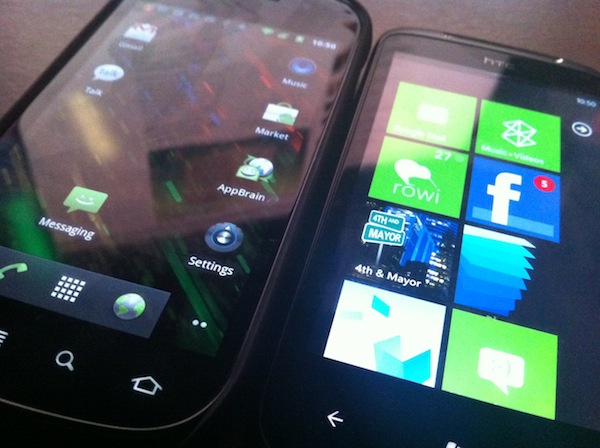
You see, it was right around the time I was experimenting with various smartphone platforms, and it just so happened that I had all four smartphones at that time — the Dell Venue Pro, the HTC 7 Mozart, a Samsung Nexus S, and of course, my trusty iPhone 4.
The only problem was that I didn’t know which phone to take. Like I said, a pretty enjoyable dilemma.
On one hand, I needed something that would serve me well. Something that I was already familiar with — and that meant my iPhone 4, capable of pretty much anything I wanted to throw at it.
On the other hand, there wouldn’t be a better test case for how well Android would hold up in an unfamiliar city, in unfamiliar surroundings, where a few seconds could make all the difference in the world.
I was pretty sure I wasn’t going to take the any of the WP7 phones — as this was pre-Mango, I didn’t think they were quite at the level I wanted them to be for every-day use.
For the record, I ended up bringing both my iPhone 4 and my Nexus S. I used the Nexus S as my primary phone, but my iPhone 4 was always waiting for me in my other pocket, or in my bag.
And you know what? The Nexus S wasn’t too bad, with perhaps one issue: the GPS was incredibly, incredibly slow to get a solid lock. I mean, you don’t appreciate just how fast the GPS lock is on iOS until you’ve experienced the same thing on Android. Now, I’m fully prepared to admit it might have been my particular phone and software combination — but then I ask myself, if this is the experience that Google mandates, I can only hope that other manufacturer and software combinations are much, much better.
Once it got a lock it was fine, though. The 3D navigation stuff was particularly impressive, even on foot.
Bottom line: Android isn’t bad, but I still prefer iOS.
This post part of Blogtober 2011, just a little thing of mine where I (attempt to) post something up on my blog every day in October 2011.Android Addendum
Blogtober 2011 catch-up, part III
Because some of still couldn’t be convinced that my comparisons were good enough, this is very likely just a small response to a few points I’ve seen around the place.
Your issues are due to hardware!
Are you serious? The Nexus S is a newer phone than the iPhone 4, and if you’re actually insinuating that the Gallery lag is attributed to hardware issues, you must be mistaken, because there’s no way. I mean, if Android doesn’t run on the phone that Google use for development, what hope is there for other phones?
I don’t have those issues with my phone!
Oh, this again? Look, I’m not made of money, I’m just an ordinary consumer trying different smartphones for kicks. I chose the Nexus S because it’s the flagship Android product — the product vetted by Google — which means that it should provide the best Android experience. TouchWiz or Sense might lead to a better experience for the end user, but that comes at the cost of other issues.
Ice Cream Sandwich will fix most of your issues!
Well, if we always waited for the next great thing to come along, then we’d probably be back in the dark ages, wouldn’t we?
I think that’s about it.
This post part of Blogtober 2011, just a little thing of mine where I (attempt to) post something up on my blog every day in October 2011.Breakfast, Lunch, and Dinner with Android — Part Deux
In my previous post in the series, I detailed a few of the more user-facing things about Android, like app management, music syncing, and so on. In this post, I intend to talk more about some of the finer points of things like text selection, general usability, and finally wrap it up at the end with a few choice sentences about Android as a whole and how it compares to other mobile platforms. If the previous post was about a 3 (not quite computer illiterate and yet not quite your average nerd) on the Benny Ling official scale of nerdery, this post is about a 6 or a 7 (getting up there). Not to mention it’s fairly long… You have been warned!
You want to talk about fragmentation? Okay, let’s talk about fragmentation. Fragmentation isn’t an issue. Geeks like us might like to harp on the fact that everything (apps-wise) doesn’t run on, everything (hardware-wise), or that some apps are restricted to certain regions, or that different versions run on different devices, but the fact of the matter is, fragmentation isn’t an issue for most end users. I say “most”, because if you’re one of the unlucky few who has chosen either the cheapest Android phone you could find, or somehow gotten stuck with a manufacturer notorious for releasing updates very slowly, or even worse, not at all, then, then, fragmentation might be an issue. You can hardly blame Google for your fragmentation issues though, as it’s up to manufacturers to release updates for their phones, which also makes it super-easy for them to drop support in way of software updates for a particular phone. Exactly why I would only ever buy an Android phone either from the Nexus series (as you’re guaranteed software updates, it being the flagship Android phone at any given time)), or from HTC, or any of the other big players (Samsung just manages to sneak in here) — any other manufacturer is a crapshoot. I mean, sure you can put the latest ROM or whatever from XDA Developers on your Motorola Milestone, but do you really want to learn about bootloaders, custom restore images, and all that kind of stuff? Perhaps if you’re a geek, otherwise, probably not.
First seen in iOS, there’s a rather nice visual feedback effect to let you know when you have reached the end of a long list, or scrolled to the bottom of a webpage. The UI “bounces” to let you know there’s no more content, the scrollbar appears for a second to do the same, and you can go about your merry business. Android 2.3 brings a similar sort of effect, only instead of a UI bounce, you see a nice flash or orange whenever you reach the end of a scrollable section. It’s pretty nicely done — as you drag more and more away from the edge, you get more and more visual feedback (but only the very edge is tinted with orange, the rest is a semi-transparent white that builds upon the orange effect).
The funny thing is, I can only think of the Windows Phone 7 accent colour whenever I see these orange flashes. Orange is a good colour choice as it manages to stand out against pretty much everything, but it would have been nice if we had a choice of colours to choose from; I’m guessing that their particular implementation of this kinda of visual feedback means that basically any colour will be visible against the background. As it stands, the orange is used lots of other places, too — like when the spacebar can autocorrect a word for you, there’s a orange line that appears on it (more on text entry a little later), and even punctuation keys and suggested words use this orange colour. It’s not bad, but it could have been better. Continue Reading →
Don’t tell me it isn’t about the apps! (It is.)
I’m sitting here, thinking about the final touches of my ultra-mega Android wrap-up post, chilling out with Katy (Perry), and I realise, now more than ever, that it’s about the apps.
It’s always been about the apps.
Not about how many there are, or how many are fart apps, or or how many spam apps there are. None of that. It’s about the apps that you’ll use — yes, the platform matters, but the apps you’ll be using on a daily basis matter even more.
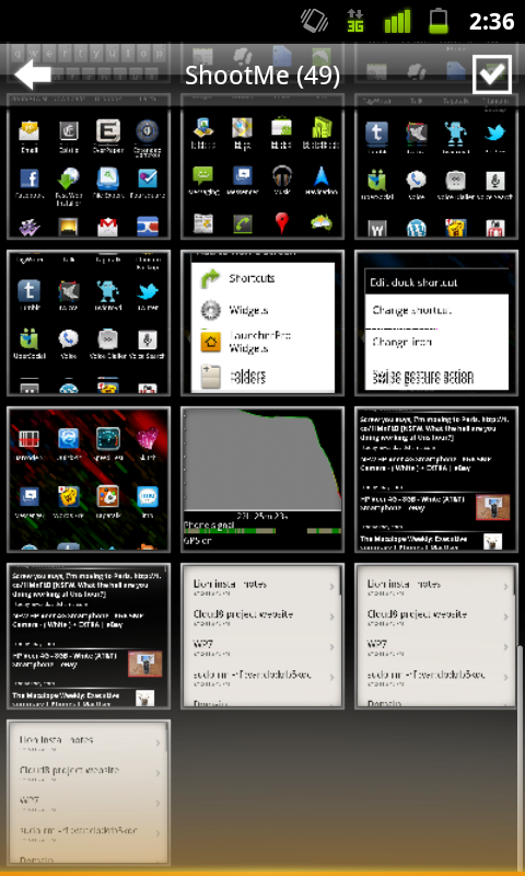
Looking back at my Android experience, not one app has been compelling enough for me to go “whoa, this is really cool!”. Not an app that I’d use daily, anyway. I mean, there’s a limit to how impressed you can be by a screenshot app, even if it is one of the best things about your Android device. Launcher Pro is great and all, but I’m relegating that to the domain of “a very nice advantage of Android” rather than anything else.
I mean, even Windows Phone 7 had the excellent 4th and Mayor Foursquare app. That was seriously good. I probably wouldn’t switch to WP7 purely for that app, but it would be a damn compelling reason to.
It’s apps like Tweebot that keep me on iOS. Apps like Instapaper. Elements. Verbs. Articles. See what I mean? I might not use some of these apps every single day, but the very fact that they’re on my device, ready for whenever and wherever my fingers need them to go, that’s what matters the most.
As much as the overall platform matters to the “bigger picture” — it’s about the apps, man. If there aren’t any really good apps in your App Store, Marketplace, or App Catalog — you better hope your web browser and email client is up to scratch.
Breakfast, Lunch, and Dinner With Android
There’s this little blog called My Dinner With Android that received some media attention a few months or so ago, and it attempts to detail one iOS user’s journey with the Nexus S. This post is where I will attempt to do the same, with a few exceptions: his previous smartphone is an iPhone 3GS, my previous smartphone is an iPhone 4. He is from the US, I am from Australia. Everything else is fairly similar. For the sake of your sanity and length, this will be yet another two-parter — the first part, this part, will focus more on Android as something to live with every day, with a few comparisons to iOS and WP7 along the way. The second, more ranty part, will probably be about how much I hate Android and all of its crazy user interaction methods — either that, or a few more details on things I’ve said here, as well as more critical look at Android as a smartphone platform and an Apple iOS competitor.
Yes, I’ve done it again. Changed smartphone platforms, at least temporarily. After my experiments with WP7 I figured I had to give Android another go, a more serious one this time. Like I said, Android is my poison of choice this time around, and the Nexus S is the chalice from which I drink. I realised my previous attempt at Android was little more than a ranting tirade about everything that was wrong about the platform, so this time around I’m going to take a more objective view.
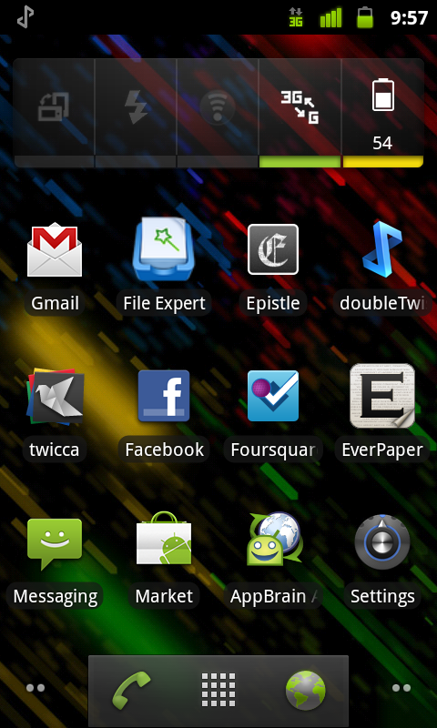
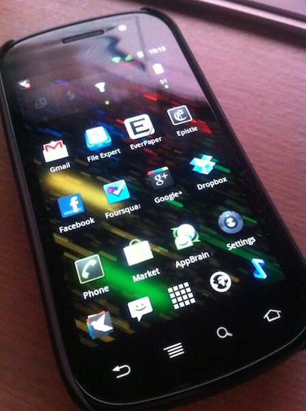
First, the hardware. So, what is the Nexus S like? It’s alright. Not fantastic like the aluminium-and-glass of the iPhone 4, but still alright. Plastic feels somewhat cheap, but overall the whole kit is passable. The most defining feature of the Nexus S is that the front glass is curved – people have said that the inwardly-curved front glass fits better against the face when you’re on a call, and it does. Oh, and the screen is a little larger than what I’m normally used to, which, when combined with the hardware navigation keys (back, menu, home) means that apps have a little more breathing room.


