-
Nintendo DS Building
-
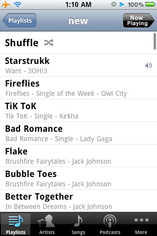
I’ll miss you, Droid Sans!
See and download the full gallery on posterous
Above: screenshot of playlist when using Droid Sans as a system font.
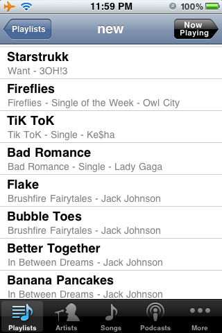
Now, I’m no typographer, but even I can tell that Droid Sans is that little bit easier to read, that little bit more fun than Helvetica. It’s a little like arranging your room just the way you want it, so that your time spent in there is all the more enjoyable. Okay, maybe quite not like that, but it’s fairly similar. I’ve been Droid-sans less for about a month or so now, ever since that iPhone developer preview came out. While I don’t regret the jump (losing a whole lot of jailbreak-goodness in the process), there are certainly things which I wish Apple would implement (customisable SMS ringtones and bluetooth file transfer being at the top of that particular list), especially seeing as we’re now at the fourth iteration of the iPhone OS so far. Droid sans was very very slick. It made something great that much better, and in this day and age, isn’t that what it’s all about?
Below: screenshot of playlist when using the standard iPhone typeface (Helvetica, I think?). -
Too many gimmicks, not enough time…
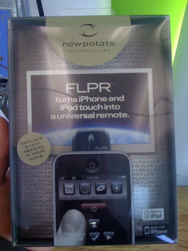
Ha! Awesome.
I’d be genuinely interested to know how well this actually works, though – my guess is it won’t replace a HarmonyOne anytime soon. -
Um, what happened here?
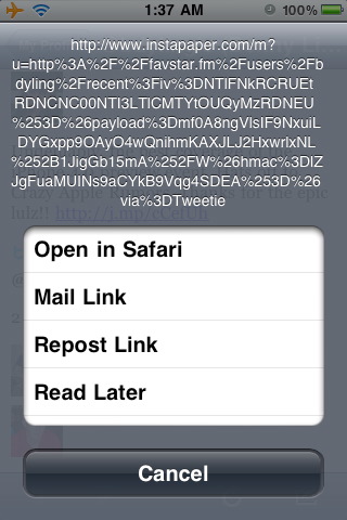
Tried to Instapaper a link a while back, and it turns out the link itself was HUGGGGE.
-
News just in: the iPhone is a COMPUTER! Mind = blown!
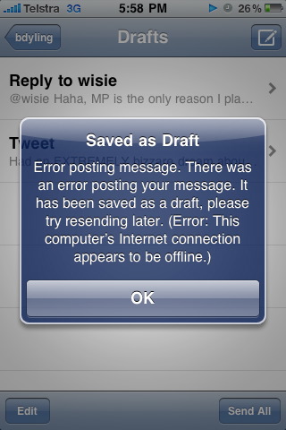
Well, according to Tweetie (now Twitter for iPhone), anyway.
-
And that’s why they call it a developer preview, folks.