Archive | Promoted

RSS feed for this section

Usually stuff I’ve written personally, stuff I think is pretty good.

Instapaper

I love Instapaper. There, I said it.

I do a fair bit of public transport, and that means lots of time to chill out with tunes and just read. Sometimes I even write, but it’s mostly about reading.

I don’t know when it happened, but about a year or two ago I stopped reading things in the browser. Not just the long-form articles or editorials I occasionally come across, but pretty much everything — shorter news pieces, reviews, basically anything and everything longer than a paragraph or two. I use Google Reader a lot, and nothing there gets read either — only skimmed, and if found to be interesting, sent to Instapaper for later perusal.

I don’t read books as often as I used to (which was sparse to begin with), but I do read my Instapaper list. I’m usually only a week or so behind my unread list — but there are some things in my “serious reading” folder (for long-form stuff) that is years old. With Instapaper, I’m never without anything to read. Now my only problem is running out of battery power when I’m out and about, but that’s a story for another time.

Instapaper isn’t just for reading, though! I also use it as a bit of temporary link storage. Links come in — from Twitter, from interesting websites I don’t want to read right now, from things on the internet which I want to refer to later — and links go out, either when I read items, or get to my Mac and open up all the stuff I’ve Instapaper-ed from Twitter or wherever else.

Remember how I was saying it’s all about the apps? Throughout my experiments with various smartphone platforms over the past month, I found that exactly none had decent Instapaper clients. IOS obviously has the official client, but there’s no such thing for Android or Windows Phone 7 — at least no client that matches the iOS one, anyway.

All the niceties you’ve come to expect from the official client just don’t exist elsewhere. There are a lot of clients that sync with Instapaper, but none that do the job as well. I’m not even talking about things like jumping to the top and then returning to the bottom, I’m talking really basic things, like the reading interface itself. Typography, style, layout — all of these things matter. If you’re an app developer, it’s great that you’re making an Instapaper client for something other than iOS, but make sure your app is good for reading; if your app isn’t usable for reading, it probably isn’t suitable for Instapaper.

This post part of Blogtober 2011, just a little thing of mine where I (attempt to) post something up on my blog every day in October 2011.
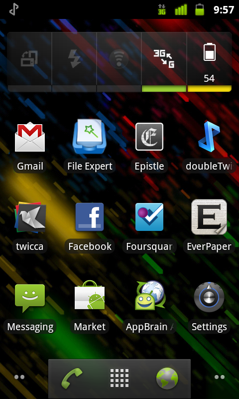
Breakfast, Lunch, and Dinner with Android — Part Deux


In my previous post in the series, I detailed a few of the more user-facing things about Android, like app management, music syncing, and so on. In this post, I intend to talk more about some of the finer points of things like text selection, general usability, and finally wrap it up at the end with a few choice sentences about Android as a whole and how it compares to other mobile platforms. If the previous post was about a 3 (not quite computer illiterate and yet not quite your average nerd) on the Benny Ling official scale of nerdery, this post is about a 6 or a 7 (getting up there). Not to mention it’s fairly long… You have been warned!

You want to talk about fragmentation? Okay, let’s talk about fragmentation. Fragmentation isn’t an issue. Geeks like us might like to harp on the fact that everything (apps-wise) doesn’t run on, everything (hardware-wise), or that some apps are restricted to certain regions, or that different versions run on different devices, but the fact of the matter is, fragmentation isn’t an issue for most end users. I say “most”, because if you’re one of the unlucky few who has chosen either the cheapest Android phone you could find, or somehow gotten stuck with a manufacturer notorious for releasing updates very slowly, or even worse, not at all, then, then, fragmentation might be an issue. You can hardly blame Google for your fragmentation issues though, as it’s up to manufacturers to release updates for their phones, which also makes it super-easy for them to drop support in way of software updates for a particular phone. Exactly why I would only ever buy an Android phone either from the Nexus series (as you’re guaranteed software updates, it being the flagship Android phone at any given time)), or from HTC, or any of the other big players (Samsung just manages to sneak in here) — any other manufacturer is a crapshoot. I mean, sure you can put the latest ROM or whatever from XDA Developers on your Motorola Milestone, but do you really want to learn about bootloaders, custom restore images, and all that kind of stuff? Perhaps if you’re a geek, otherwise, probably not.

First seen in iOS, there’s a rather nice visual feedback effect to let you know when you have reached the end of a long list, or scrolled to the bottom of a webpage. The UI “bounces” to let you know there’s no more content, the scrollbar appears for a second to do the same, and you can go about your merry business. Android 2.3 brings a similar sort of effect, only instead of a UI bounce, you see a nice flash or orange whenever you reach the end of a scrollable section. It’s pretty nicely done — as you drag more and more away from the edge, you get more and more visual feedback (but only the very edge is tinted with orange, the rest is a semi-transparent white that builds upon the orange effect).

The funny thing is, I can only think of the Windows Phone 7 accent colour whenever I see these orange flashes. Orange is a good colour choice as it manages to stand out against pretty much everything, but it would have been nice if we had a choice of colours to choose from; I’m guessing that their particular implementation of this kinda of visual feedback means that basically any colour will be visible against the background. As it stands, the orange is used lots of other places, too — like when the spacebar can autocorrect a word for you, there’s a orange line that appears on it (more on text entry a little later), and even punctuation keys and suggested words use this orange colour. It’s not bad, but it could have been better. Continue Reading →

Just Do It

As it stands, I have two assignments due in just under a week. They’re both major assignments — one requires me to write a few thousand words on ubiquitous computing with references AND do a not-insubstantial iOS programming task that involves pigs (no, it isn’t an Angry Birds clone), and the other requires me to do a Java-based version of Minesweeper.

I, of course, haven’t started either.

It’s not that I find the content boring (okay, maybe the Java one isn’t all that appealing) — heck, just today we were making a super basic read-only version of Twitter (but without actual tweets). The spec called for a normal UIButton to be placed somewhere in the interface that would link to a map view of the “tweets” on a map (I think the idea was that we were playing around with CoreLocation and MapKit). After trying a few different things and deciding that looked like crap, I stuck a UIBarButtonItem in the UINavigationBar, which made it look much cooler. A tiny, ten-second version of going above and beyond, but my interest was definitely piqued.

Like I said, it’s not that I find the content boring. Most of my Uni subjects have been interesting enough, but try as I might, I just can’t find the motivation to get things done (and by things, I mean super-huge-mega-assignments that always seem to get left to the last minute).

It’s not that I’m lazy, either — at least, I don’t think it is. I’m definitely very un-lazy about some things, recent examples including staying up for Apple keynotes, and downloading and installing the Battlefield 3 beta so I can play — and later this month, I plan to go to the midnight launch of Battlefield 3 at my local games store. That’s not lazy, right?

So what is it?

This post part of Blogtober 2011, just a little thing of mine where I (attempt to) post something up on my blog every day in October 2011.
Breakfast, Lunch, and Dinner With Android

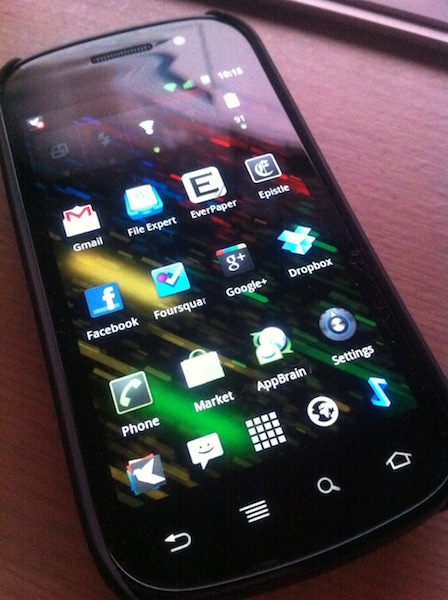
There’s this little blog called My Dinner With Android that received some media attention a few months or so ago, and it attempts to detail one iOS user’s journey with the Nexus S. This post is where I will attempt to do the same, with a few exceptions: his previous smartphone is an iPhone 3GS, my previous smartphone is an iPhone 4. He is from the US, I am from Australia. Everything else is fairly similar. For the sake of your sanity and length, this will be yet another two-parter — the first part, this part, will focus more on Android as something to live with every day, with a few comparisons to iOS and WP7 along the way. The second, more ranty part, will probably be about how much I hate Android and all of its crazy user interaction methods — either that, or a few more details on things I’ve said here, as well as more critical look at Android as a smartphone platform and an Apple iOS competitor.

Yes, I’ve done it again. Changed smartphone platforms, at least temporarily. After my experiments with WP7 I figured I had to give Android another go, a more serious one this time. Like I said, Android is my poison of choice this time around, and the Nexus S is the chalice from which I drink. I realised my previous attempt at Android was little more than a ranting tirade about everything that was wrong about the platform, so this time around I’m going to take a more objective view.

First, the hardware. So, what is the Nexus S like? It’s alright. Not fantastic like the aluminium-and-glass of the iPhone 4, but still alright. Plastic feels somewhat cheap, but overall the whole kit is passable. The most defining feature of the Nexus S is that the front glass is curved – people have said that the inwardly-curved front glass fits better against the face when you’re on a call, and it does. Oh, and the screen is a little larger than what I’m normally used to, which, when combined with the hardware navigation keys (back, menu, home) means that apps have a little more breathing room.

Continue Reading →

Razer Onza Tournament Edition

Short, mini-review: works well in Burnout: Paradise. Trigger design a little weird, sometimes a little uncomfortable. Hyper-response action buttons (X Y A B) have almost zero travel, but feel crisp. Backlit keys are cool. Cord is fantastically long. Can’t really tell the difference between the most and least resistant of the adjustable-resistance keys. Shoulder buttons are super-clicky, like clicky in the extreme. Haven’t tried the programmable buttons.

Overall: it’s different. I think the next controller I buy might be the standard controller (the new one, with the ultra-cool transforming d-pad).

Update! Apparently I’m an idiot who doesn’t know how to work technology, because I only figured that the clicking sounds the adjustable-resistance analog sticks were making were it actually, um, adjusting the resistance, and not breaking all the things. With the resistance now adjusted, I can definitely feel the difference between settings, and it definitely makes a difference in twitch-reaction games, or games were precision is necessary. Recommendation upgraded from “meh” to “actually not bad”.

What I don’t like about the Dell Venue Pro

Selling off my HTC 7 Mozart and going back to my loaner Venue Pro (portrait WP7 slider) made me finally realise why I don’t like it: it has a curved screen.

The curve on the Venue Pro is convex, meaning that it’s got a very slight bulge outwards; exactly the opposite of what you really want on a display. When the iPhone 4 came out, many tech pundits harped on about how the glass on top of the display was fused to the LCD underneath, and how that made the content appear that much closer to your finger whenever you touched it.

The Venue Pro is the opposite; the horizontally-convex (that is, bulged outwards in the middle and less so at each side) display means that content feels further away from your fingertips, which makes for a weird touchscreen experience. On a display that already feels sub-par, it’s exactly what you do not want.

Anyway.

Heaps of posts upcoming. There’s something special coming up very, very, soon, and then there’s the big ol’ MicroServer write-up I might do, oh, and a HP TouchPad review-slash-webOS extravaganza somewhere in the middle. I wouldn’t expect the TouchPad review until early October, and the MicroServer sometime after that. Uni will get really busy really soon, and doubly so for me, procrastinator extraordinaire.