Breakfast, Lunch, and Dinner With Android
There’s this little blog called My Dinner With Android that received some media attention a few months or so ago, and it attempts to detail one iOS user’s journey with the Nexus S. This post is where I will attempt to do the same, with a few exceptions: his previous smartphone is an iPhone 3GS, my previous smartphone is an iPhone 4. He is from the US, I am from Australia. Everything else is fairly similar. For the sake of your sanity and length, this will be yet another two-parter — the first part, this part, will focus more on Android as something to live with every day, with a few comparisons to iOS and WP7 along the way. The second, more ranty part, will probably be about how much I hate Android and all of its crazy user interaction methods — either that, or a few more details on things I’ve said here, as well as more critical look at Android as a smartphone platform and an Apple iOS competitor.
Yes, I’ve done it again. Changed smartphone platforms, at least temporarily. After my experiments with WP7 I figured I had to give Android another go, a more serious one this time. Like I said, Android is my poison of choice this time around, and the Nexus S is the chalice from which I drink. I realised my previous attempt at Android was little more than a ranting tirade about everything that was wrong about the platform, so this time around I’m going to take a more objective view.
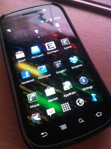
First, the hardware. So, what is the Nexus S like? It’s alright. Not fantastic like the aluminium-and-glass of the iPhone 4, but still alright. Plastic feels somewhat cheap, but overall the whole kit is passable. The most defining feature of the Nexus S is that the front glass is curved – people have said that the inwardly-curved front glass fits better against the face when you’re on a call, and it does. Oh, and the screen is a little larger than what I’m normally used to, which, when combined with the hardware navigation keys (back, menu, home) means that apps have a little more breathing room.
Truth be told, the Nexus S isn’t all that different to the other Samsung series, the Galaxy S. Mainly, the differences can be summed up thusly: the Nexus S has no external storage slot, no 720p video recording, no Bluetooth 3.0, no FM radio. What the Nexus S does have is a three-axis gyro, a LED flash, and… that’s about it. It seems the only reason you would buy the Nexus S over the Galaxy S is for the fact it’s the current flagship handset from Google, for Android. The other reason is Stock Android with a capital S, without all that carrier crapware or TouchWiz bloat — which is lucky, because both reasons are exactly why I bought it in the first place. There are probably other phones that would be more suited for daily use (I’ve heard HTC Sense, for example, is much improved), but for the purposes of this experiment I thought it prudent to experience Android in its purest form, and that meant the Nexus S.
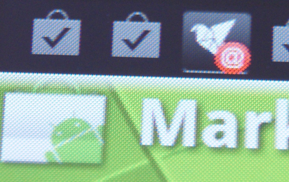
The other defining feature of the particular Nexus S that I was using (the 850MHz HSDPA-compatible i9020A) is that it has an Super AMOLED display. I won’t go into how SAMOLED is different to LCD, but coming from an LCD-equipped iPhone 4, everything is as they say. The colours are more vibrant, more saturated, and then there’s the downside of PenTile; things just don’t look as good as they’re supposed to. It’s not even about pixel density (the Nexus S has 235ppi compared to the iPhone 4’s 326ppi), nay, its about how sharp things look. Instead of clear, crisp edges, it’s like there’s a very slight blur to the edges of certain things, like the buttons on the keyboard, or the horizontally-straight edge of any UI element. Sometimes, when scrolling certain types of information, you’ll see random flashes of red — most likely due to the not-quite-RGB sub-pixel arrangement. And they say all SAMOLED displays are like this1? I’ll stick with my IPS LCD, thanks. Sure the tiny graphical difference doesn’t really impact on daily usage at all, but it’s a quality thing, the difference between a B+ and an A-.
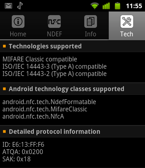
For all the inequalities between the Nexus S and the Galaxy S series, there is one major area where the Nexus S pulls ahead in terms of hardware, and that is the area of NFC support — the Galaxy S has none. The Nexus S contains built-in NFC hardware, which means you can read and write RFID tags or similar. Sure, you could argue that NFC is all but worthless in a country that has only just started to adopt contactless payments, but it’s actually pretty cool in practice. Andrew was generous enough to send me some NFC-enabled tags, and using a few free apps from the Marketplace, I was able to write information onto the tags and then read them back to do pretty cool things (like check in on Foursquare). I had envisioned being able to replace my Metro GoCard (which is a contactless method of payment for public transport here in Tasmania) with my Nexus S, as the GoCard is simply an implementation of the MiFare Classic 4k system, but unfortunately card-emulation is possible, but presently a little difficult due to various technical limitations. I was able to read the tags just fine, just not decrypt the contents. A shame, really — I would have loved to just read-in all of my NFC cards and then replaced them all with my Nexus S.
Now, the software: the last time I looked at Android was quite a while ago, when 2.2 was just around the corner. With the Nexus S I have skipped 2.2 completely and jumped straight to 2.3, or the release of Android otherwise known as Gingerbread.
To be honest, not all that much has changed. Or maybe I just can’t tell, seeing as it was so long ago. I can recognise changes here and there, like the Marketplace app and the overall Marketplace improvements, or things like what stock Android is like compared to Sense UI, but some of the other changes are subtle.
The UI, the overall look and feel of Android is just cartoon-y. Say what you want about iOS and how it has become “boring”, but on iOS there’s a certain refinement that’s unparalleled on any other platform to date. The icons in Android look like thrive been designed to entertain small children, not professionals or those in serious business. Live wallpapers seem to be geared towards those with short attention spans, and the look and feel of the graphics tries oh so hard to impress you, but it just falls short. There’s UI where there doesn’t need to be.
Something that a normal user might want to do is sync music onto their Android2 — haha, gotcha! You can’t. You cannot “sync” music onto Android handsets (if we take the definition of sync to mean “automatically update a set of songs via a playlist or otherwise”). Never mind. The “normal” way to get music onto your Android device is to enable USB mode, then drag and drop all your MP3s onto the thing. Want playlists or something else? Too bad, you’ll have to create those manually, not to mention how fantastically out of luck you are if you want to sync your existing iTunes library across.
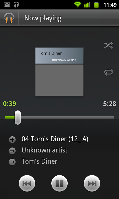
Thankfully, your salvation if you want to have some sort of iTunes-like replacement for Android exists in a brilliant app called DoubleTwist. You can use either the DoubleTwist app on the device, or you can use the stock Music app, but on your computer, using DoubleTwist means that DoubleTwist handles all of the syncing stuff. It’ll even import your existing iTunes library, along with all of your playlists — it’s actually the one great thing about Android, and makes my (albeit temporary) switch all that more bearable.
Let’s talk about apps for a second. Not the actual apps, but rather, how you deal with apps on the device. First, you need to get the apps from the Marketplace, onto you phone. you can do this a couple of different ways, but the two most popular are probably directly from the Marketplace app on the device, or from the Marketplace website on your computer.
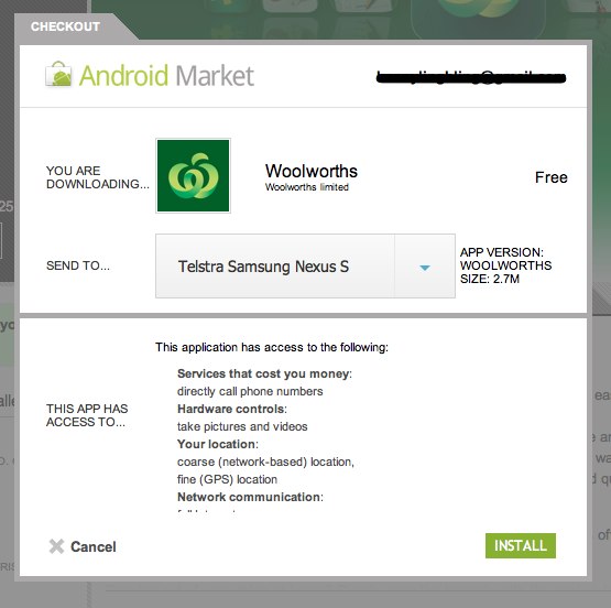
The first method is easy enough (and works just like what you’re used to in iOS), but the second one is a little more interesting. The Marketplace web access is particularly cool, as not only does it feature a fully browseable, searchable copy of the same Marketplace (albeit without geographical restrictions), in your web browser (something Apple haven’t quite worked out how to do), but it also allows for one of the coolest features on Android, the Web Install.
Web Install is actually great, truly fantastic. Forget downloading an app on your computer and then having to sync your phone to get the app on there, what you can do is just hit the “install” button on the Marketplace website, which will then automagically start downloading the app onto your phone. It’s super-cool, and means that you can do things like trawl websites for cool apps, and install them your phone without even touching your phone at any stage. Lest I be accused of being an Apple fanboy, yes, the automatic app downloads feature in iOS 5 is pretty similar in that it automatically installs apps on your phone one you’ve purchased them on your computer, but Web Install means that you don’t even have to have iTunes on your computer, just a web browser and your Google Account.
Great, so you’ve got apps on your device, now, how do you get them off, say, in case you’re running out of internal memory? On iOS, you long-tap the icon until all the icons start to wiggle, then press the “X” in order to remove the app from your device, then tapping OK to confirm. On Android? All you have to do is tap the menu key, then settings, then applications, then manage applications, then scroll to the application you want to remove. Then tap it, then tap uninstall, then tapping OK to confirm. As you can see, it’s probably one of the most convoluted actions for something that should really be much, much simpler. I don’t know, it’s almost as if either Google has deliberately made removing applications hard because it wants you to keep them on your device, or that Google just doesn’t care about usability. Both are equally bad.
All in all, stock Android is pretty bland. On the stock launcher, you can’t choose how many homescreens you have, or customise the icons in the dock. Luckily, Android has plenty of room for (third-party) customisation — all of which will be discussed in the next post in the series. Watch this space.
-
With the exception of Super AMOLED Plus, which apparently doesn’t use the PenTile RGBG pixel matrix, instead opting for the much more common (and, visually superior) RGB arrangement.
-
Or, you could do the whole cloud thing and use something like the Google Music Beta. But most people would just sync their music.
