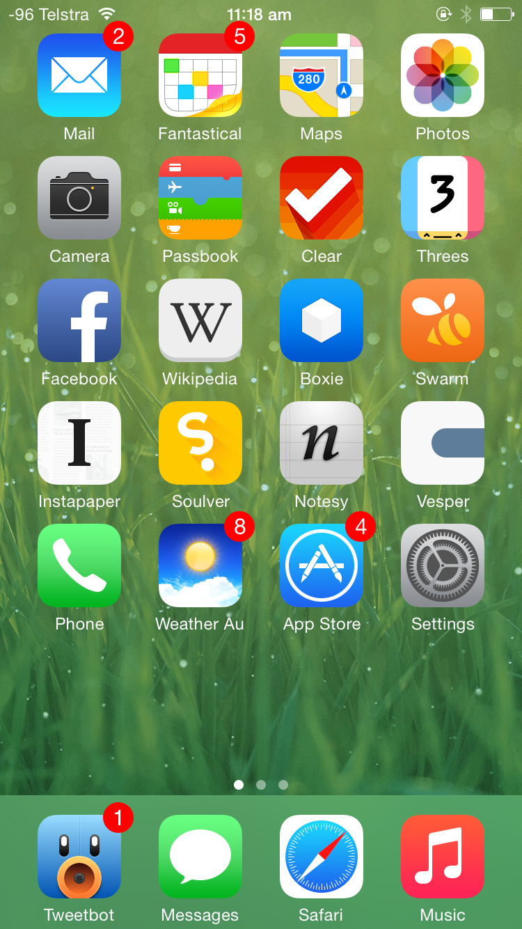
My iPhone 6 Home Screen
The last time I did one of these was back in 2013 not too long after the iPhone 5 was released, so we’re definitely long overdue for an update on my home screen. I think it’s interesting how this kind of thing changes over time, either because apps stop getting updated, better alternatives come along, or my own usage patterns change. Either way, let’s get into the nitty gritty.
I don’t have a definitive screenshot of my very first iPhone 6 Home screen, but I think is the closest thing, and it’s certainly the only home screen screenshot from just after the iPhone 6 release back in September 2014. As you can see, not that much has changed from the iPhone 5 home screen: besides adding another row of apps, introducing a whole new dilemma for home screen icon organisation, I’m more or less using the same apps.
Old favourites Fantastical, Clear, Facebook, Boxie, Instapaper, Soulver, Notesy, Vesper, and Pocket Weather Australia all make a return, and Tweetbot retains its coveted number-one spot on the dock. This being a year after the introduction of iOS 7, most apps and their icons have made the jump to feature the divisive flat design.
Changes to apps between my iPhone 5 and iPhone 6 include swapping out the much-loved, but unfortunately no longer updated Articles for the surprisingly great official Wikipedia app, which has all the features I care about in a mobile Wikipedia interface. Following the developer joining Apple, Articles isn’t the first app that was abandoned, and it certainly won’t be the last to be swapped out for a more modern alternative.
The demise of App Dot Net also saw the removal of Felix from my home screen. A pity and a damn shame it’s no longer available in any shape or form, as I’d rate Felix in my top five iPhone apps of all time based on aesthetics and usability alone despite the fact it was tied to a promising, if ultimately doomed, social network.
Sometime in 2014, Foursquare decided to split its app into two. Foursquare became the app for place recommendations, while Swarm was the gamified version, the one you used to check into places and collect mayorships based on how many times you had been there recently. Because the mayorships and check-ins was the original reason I joined Foursquare, I decided to keep Swarm on my home screen. Foursquare was relegated to a folder.
Threes is the only game to feature on my home screen, but mostly because it’s perfect for the in-between moments that life sometimes gives you.
Note that I’m still using multiple pages of home screens, with single icons on the first home screen, some folders on the second, and mostly games on the third.
