Archive | 2012

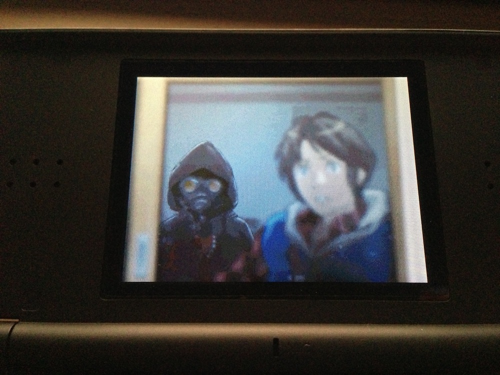
999: Nine Hours, Nine Persons, Nine Doors

How do you write a review of the best game you’ve ever played?

Excuse me, that was a little melodramatic — but how do you write a review of one of the best games you’ve ever played?

How do you even begin to describe the combination of an incredible storyline, fantastic pacing, and solid gameplay, all mixed into what is easily one of my favourite games of all time?

999 is one of those things I wish I could forget. Not because it’s bad, no, exactly the opposite: it’s so good that I want to be able to experience it all over again. I want to play it again, but it just won’t have the same impact as it did the first time around.

But where are my manners? I haven’t even told you about the game, and here I am, already singing its praises like it’s the best game I’ve ever played.

So we’ll start at the start.

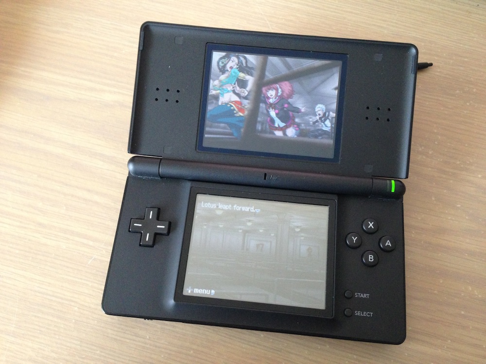
999: Nine Hours, Nine Persons, Nine Doors is a visual novel. It’s similar to games like Ghost Trick and more recently The Walking Dead in that the entire thing is completely story-driven. There’s parts where you actually play the game and make decisions that have some kind of impact on what happens, to be sure, but for the most part, you’re just along for the ride, wondering where it will take you.

999 doesn’t have any kind of spoken dialogue. It means the game comes of as rather text heavy, but that’s par for the course with these kinds of visual novels/interactive stories. The Walking Dead has endless cutscenes, and 999 has text. Lots and lots of text, seeing as that’s kind of the only way it can tell you what’s going on and how the story is progressing. It comes of as text-heavy at the best of times, but it works well — the text isn’t something that ever becomes overburdening at any point, is what I’m saying. The delivery of text is near-perfect, and you never feel like you’re being swamped with information.

When you’re not progressing the story through these semi-cutscenes (which can include the odd decision here or there), you’re playing the other part of the game. You see, gameplay in 999 can be broken into two parts: there’s the story-based cutscenes, if we can call them that, and then there’s the escape sequences. During these escape sequences you’re tasked with escaping from whatever room you’ve found yourself trapped in, and the sequences themselves play out a little like some kind of point-and-click adventure game. In most cases, you find objects, combine them with other objects, and then use them to escape the room — somehow. Sometimes your companions will give you hints on how to use the items you’ve collected, or hints on what you’re supposed to be doing to escape the room, but for the most part, you’re just left to explore rooms on your own.

Yes, you’re not the only one in this story. As the title might suggest, along for the ride are eight other individuals. There’s a few other characters that play minor roles, but for the most part, the eight characters and you are the only ones that really matter — when you meet the other characters for the first time, you’re not really sure who they are, what backgrounds they have, or why they’re with you. All you know is, something out of the ordinary is going on, and it’s up to you to find out what and why.

Actually, that’s not entirely true: the Nonary Game and associated rules are revealed pretty early into the piece by one of the so-called “bad guys”, and it soon becomes clear you’re just a pawn involved in some kind of game. A game where you have to find answers to questions such as: why were you chosen for the game? Why were the others chosen for the game? And perhaps the question with the most elusive answer of all: what is the purpose of the game?

The puzzles you’ll encounter as you play the game are fairly simplistic, for the most part. Usually you’ll be able to solve puzzles by combining objects, using objects with the environment and using some lateral thinking to work out how to escape out of the current room. No puzzle is impossible, although you might find yourself scratching your head on occasion when you just can’t figure out the answer. Random guessing will ocassionally reveal the answer, but some answers simply can’t be obtained by guessing every combination, and indeed, there are cases where doing so would take quite a lengthy time indeed.

Quite a few puzzles involve numbers and the concept of a “digital root”, as that’s one of the key concepts the Nonary Game is itself based around. The digital root is just the digits of any number added until only a single digit remains: for example, the digital root of 5, 7, and 3 would be: 5 + 7 + 3 = 15 = 1 + 5 = 6. Over the course of the game you’ll be using these digital roots to solve puzzles and progress though the Nonary Game; just try not to think about how the numbers do or don’t add up at any given time — there’s enough on your plate as it is without adding that kind of stress.

Solve the puzzles, make the right decisions, and maybe you’ll get to the end of the game.

But that’s just where it all begins.
Continue Reading →

On Starting Again, Earth-Scorching, and Legacy

You’re familiar with the scorched earth concept, right? Wikipedia says it’s a military strategy where a retreating force destroys anything in their path that might be useful to the enemy. It’s this idea that if the enemy captures that territory, it’ll be useless to them. The scorched earth concept is mostly applied to retreating forces since there’s a higher likelihood the enemy will capture that land anyway, but here’s the rub: it can also be used for advancing forces, too.

I’ve been toying around with the idea of starting an entirely new blog in my head over the past week. Not just “Benny Ling’s Bling 2.0”, but something entirely new and fresh.

On the one hand, the idea of starting again is exciting. Leaving all the old stuff behind so there’s no baggage, nothing tying me down or holding me back. Free to explore new horizons, a place to write about stuff I find exciting and things I’m enthusiastic about, and so on.

On the other hand, I’m the kind of person that would feel extremely sentimental about all the old stuff I’m leaving behind. I mean, I get sad throwing away parts of my childhood, even stuff that I have absolutely no rational use for today or in the future, stuff that I haven’t touched for years. There’s quite a number of posts here that are nothing more than short sentences on a particular topic — which is great, sure, but compared to some of my longer pieces?

When I first started this blog I wasn’t sure if I wanted it to be a Tumblr-style reblog-fest where I’d repost any old trash from my social network, or whether I wanted it to be only about my writing. At first it was the former, and for a little while, I wrote a few bits here and there about cool things. But somewhere along the way I must have decided that maintaining such a blog was either daunting/exhausting/too-much-work or all of the above, because I soon stopped posting about stuff I had written and simply linked to stuff online that I thought was cool.

And don’t get me wrong, I still think most of that stuff is cool and/or worth your time, it’s just that, well, is my blog the right place for it?1 Do I want that stuff to have the same permanence as the stuff I’m proud of, the stuff that I’ve written personally? Stuff like my gaming reviews, pieces on why iOS is kicking Android’s butt, and putting together home servers.

Which is why I’m drawn back to this idea of starting again, and having a place for just my writing. It’ll mean less updates, even more sporadically than they currently are, but maybe — hopefully — it’ll mean an increase in quality.

Continue Reading →

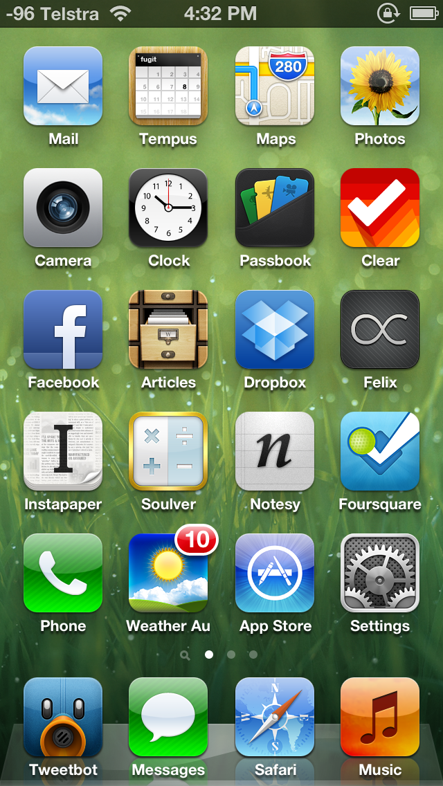
My iPhone 5 Home Screen

It’s been a while since I last wrote one of these things, and after reading about how good the Windows Phone 8 home screen is (and the story of how it came to be), I realised even though this kinda thing only interests a handful of people, it’s still interesting to me.

So here goes.

My previous iPhone homescreens were organised according to what I’m calling a “loose Ben Brooks configuration”, that is, one based loosely upon the methodology upon which Ben Brooks organises his homescreen. The iPhone 5 introduces a new dilemma in this regard, which Ben has also covered, but I’ve come up with my own spin on things. Instead of not using the very top row (which Apple’s new human interface guides says not to bother about, UI wise), I’ve simply added an extra row somewhere in the middle. Why? Because it’s really not that much of an issue being able to reach the entirety of the iPhone 5 display — even when using it one handed — like Apple’s “Thumb” ad shows.

Anyway, to the apps:

First row: Mail, Tempus, Maps, Photos

Tempus now occupies the position previously occupied by Calvetica. It’s a calendar replacement by the same developers, but somewhere along the way, I fell out of love with Calvetica. While it was still a great calendar replacement, it wasn’t the same app it originally was, something even the developers themselves admitted. Tempus is the minimalist calendar replacement I’ve wanted — but it has to be noted this is the only app on my homescreen that doesn’t support the taller iPhone 5 display. The developers say it’s coming “in the future“.

Also  notable is the Apple Maps app, instead of the great Maps+ replacement. I want to like Apple’s maps in iOS 6 because they’re superior in a number of ways (vectorised maps, much lower data usage, heaps of caching), and this is my way of doing so. For the record, Maps+ is just a small swipe-towards-the-left away, if and when I run into any issues.

Second row: Camera, Clock, Passbook, Clear

Passbook is here because I’m a big fan of the concept — if only more retailers would jump on board, it would likely be on your own homescreen, too.

Clear is here because it’s my go-to for doing short lists, fast. The completely gestural interface is insanely brilliant, and I enjoy it a lot — it’s a great app for making short lists very quickly. I don’t use it for actual reminders (because I’ve got Reminders for that), but it is useful for short lists: to-dos, shopping lists, games I want to buy, and so on.

Third row: Facebook, Articles, Dropbox, Felix

Facebook was one of the apps “promoted” from the second homescreen to the first, thanks to the four extra apps I can have on the first homescreen. I don’t use it as much as, say, Tweetbot, but it’s still there when I need it to be.

Articles for reformatted Wikipedia articles, and Dropbox for accessing my Dropbox documents when I’m out and about.

Felix is one of the better App.net clients out there — you know, that semi-exclusive social network that popped up recently. By nerds, for nerds. Netbot could just as easily be occupying this position, but Felix has Helvetica Neue on its side.

Fourth row: Instapaper, Soulver, Notesy, Foursquare

Instapaper continues to be the best way to read later and Soulver remains the best calculator.

Notsey takes over from Elements as my Markdown-enabled, Dropbox-syncing plain text editor of choice — it doesn’t use Museo Sans like Elements does, but I was sick of the error messages Elements would frequently pop up. Notesy is perhaps a touch more customistable than Elements is, but otherwise, they’re pretty much the same app.

Foursquare was also one of the promoted apps from the second homescreen.

Fifth row: Phone, Pocket Weather Australia, App Store, Settings

Pocket Weather Australia (a.k.a. Weather Au) is the best weather app for Australians, period. After languishing in a folder in the second page for too long, it now gains a spot on the homescreen — with the “feels like” temperature for my current location as the icon badge constantly updated. It’s an insanely beautiful app that’s also available on Android, if you’re so inclined.

Dock: Tweetbot, Messages, Safari, Music

Tweetbot is among the few apps that mean I won’t be leaving the iOS platform any time soon. I’ve never seen an Android app that even comes close to the quality of Tweetbot, and it’s unique in that it’s perhaps one of the only apps that actually deserves a place on the dock. It’s amazingly good. Oh, and I occasionally use it for Twitter, too.

I still mourn the loss of the iPod app.

Miscellaneous

I’m actually using one of the default background wallpapers. Apple has done an amazing job picking out the default wallpapers that come with iOS 6 — a few are flashy, yes, but the rest are beautifully subtle, two-tone affairs suitable for use on both the lockscreen and the homescreen.

If you want to enable the numeric signal strength without jailbreaking, follow these instructions.

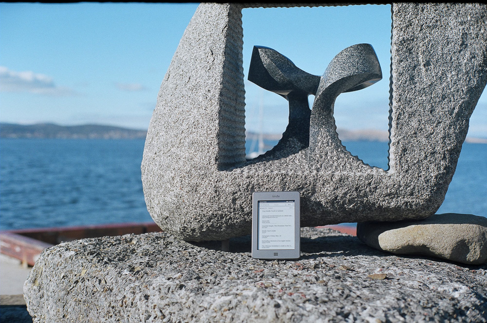
The Amazon Kindle Touch

I had honestly wanted to write a review of this new book reading gadget after actually finishing a book on it, but after buying a Kindle Touch over 6 months ago, that still hasn’t happened. It’s not that I’m not a slow reader or anything, it’s just that I don’t think I’ve gotten used to the idea of picking up another piece of technology to read a book, instead of, you know, picking up an actual book. (And plus, the Steve Jobs biography is a pretty massive book to cut your teeth on. And, to be honest, I haven’t made the time to just sit down a read.)

There are a few things that appeal about the Kindle Touch:

  • It’s a device that’s infinitely more portable than lugging around however many books. If you’re travelling and want something to read on the go, this is a huge plus.
  • It has Wi-Fi so I can instantly buy anything I fancy, or simply add it to my Amazon wishlist for later. No more maintaining lists of books I want to buy on scraps of paper, in emails, whatever.
  • The battery life is amazing. It’s the first device I’ve owned with battery life measured in weeks, not hours.
  • E-ink is where it’s at for reading books, because LCDs just aren’t up to the task.
  • Oh, and it works great with Instapaper — perfect for the long form content that’s a little longer than a bus ride or even a lazy Sunday afternoon.

Reading with e-ink is a little strange to get used to. It’s not altogether bad, just different. It replicates the reading experience of a book very well, even if it doesn’t have the same texture nor feel of an actual book. Really, the only issue with the e-ink display is reading in dimly lit environments — just like a real book, you need to turn on a light.

The response time of e-ink is perhaps the only real sticking point for potential Kindle users to be aware of. It’s something you’ll definitely notice if you’re coming from any other kind of display tech, unless you’re used to half-second refreshes. It’s totally fine for simple reading, but might present an issue if you’re trying to actually get things done on the device. It’s no productivity machine, and the built-in keyboard, whilst good for the odd Amazon store search or the occasional annotation, is best used where speed isn’t a priority.

Kindle 4 bezel (top)

Kindle Touch bezel (bottom)

But why the Touch version of the Kindle, rather than the normal, non-touch version? As much as I wanted a version of the Kindle Touch with physical page-turning buttons, Amazon don’t make such a device. Instead, the Kindle Touch is a capable device in it’s own right. Just about the only thing you might notice is the slightly more inset bezel compared to the non-touch, which means light can cast shadows more easily, as well as giving the device a more inset feel. It’s strange, especially coming from an iPhone where the LCD is as close as humanly possible to the glass so it feels like you’re touching the pixels. Not a huge deal, but definitely something to be aware of.

Book purists amongst you (apparently that’s a thing now) might scoff at ebooks. And honestly, I kind of do as well — there’s nothing like sitting down with a good book, feeling the paper on your hands as you turn the pages of yet another gripping tale. The last physical book I bought was probably the last book in the Artemis Fowl series, back in July — and why? Because I already owned every other book in the series in paperback format. At one point I even experimented with iBooks on the iPhone, seeing if I could read Artemis Fowl: The Atlantic Complex entirely in iBooks, even when I already owned the paperback version of that, too — I could, but it just wasn’t the same.

But you know what? Books might have battery life measured in decades, but they’re heavy. They might feel exactly like a book should, and I might be able to lend them out to others, but I can’t highlight and annotate passages (more out of respect of the book than wanting to go mad with a highlighter through my books) like I can on the Kindle. There’s no instant delivery — I can’t decide I want a book, search for it, and have it on my device in seconds.

The Kindle brings books to those who don’t have the space for a few books here and there. The Kindle makes books accessible. The Kindle means no delivery fees, no waiting — just books on demand. More books than anyone could ever read. There’s no such thing as a “sold out” book on the Kindle.

So I’ll continue to buy both physical books, mainly for authors that I really enjoy, and books on the Kindle. Maybe I’ll even buy both versions of a book, and then wonder why my place isn’t synchronised across books — then I’ll realise dead-tree books don’t have Wi-Fi, find my place, and read on.

All in all, I like the Kindle Touch. It’s a great device for reading, Amazon’s book selection is extremely good, and the hardware is on par for a device meant for long usage periods.

Now, if only they sold a version which had some kind of in-built light… and if only I had more time to read books on the thing, maybe I’d actually have finished the Steve Jobs biography by now.

Das Keyboard (Model S Professional Silent)

If there’s something interesting about humanity, it’s that people want better products. Products that not only satisfy some kind of need, but do it in a way that’s better than anything else on the market. From swanky coffee machines and Herman Miller chairs, all the way through to Apple products and whatever else you care to name, these kinds of products command premium price tags and claim to offer better experiences. And now, even the humble keyboards has joined this cohort.

This desire for premium products that offer better experiences than their lesser-priced counterparts begs the question: wouldn’t you want a better typing experience, if you could have it? If you’re going to spend long hours typing things into a computer, wouldn’t you want a better input mechanism for that input?

The thing is, you can. Ladies and gentlemen, let me introduce you to the loudest, most obnoxious keyboard you’ll ever use: the mechanical keyboard.

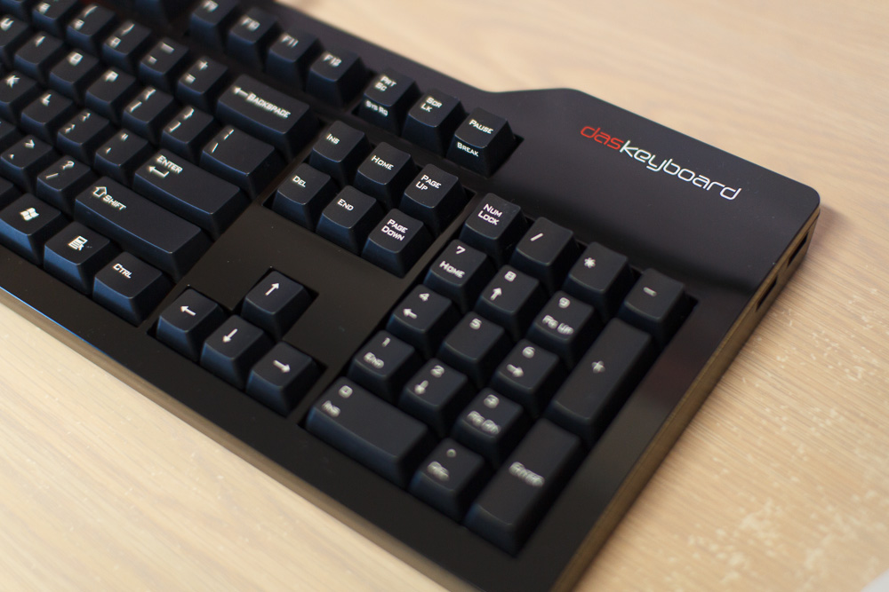
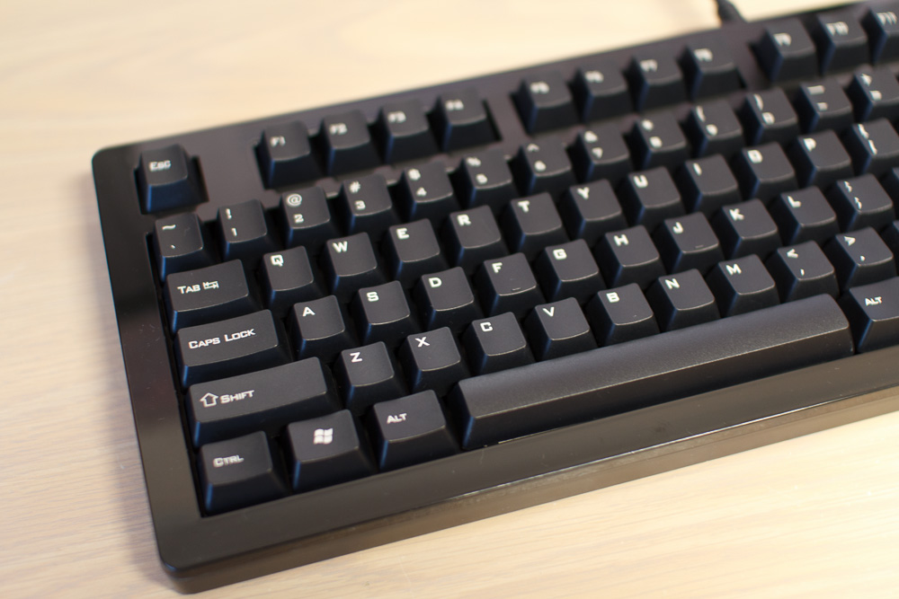
A little while ago I picked up the Das Keyboard Model S Professional Silent, a mechanical keyboard with Cherry MX Brown switches (more on this later). It’s a mechanical keyboard designed for PCs, even though my primary usage is with a Mac (again, more on this later), and it offers a fantastic typing experience. As well as having the distinction of the most expensive keyboard I’ve ever owned, it also carries a far more prestigious title:

It’s the best keyboard I ‘ve ever owned.

Aesthetics
The first thing you have to understand about the Das Keyboard series of mechanical keyboards is that they are big black monoliths. They can easily take over your desk if you give them the chance, and these days even my 27″ Dell UltraSharp looks smaller by comparison. From what I can tell, most of the Das keyboards sport more or less the same design: they’re big, black, and, for the most part, have glossy surfaces with matte black keys. The Professional series of their keyboards feature the labelled, laser-etched keys, while the Ultimate series simply have blank keys.

As for physical dimensions, the Das isn’t overly huge. Generously sized, perhaps, but not overly huge. They’re a few centimetres longer than the Apple aluminium keyboard with numeric numpad, my previous keyboard, but nothing too extreme. You probably won’t notice the extra length unless you have a tiny desk, or have some kind of aversion to innuendo in seemingly innocuous keyboard reviews.

Overall, the build quality of the Das is good. It feels incredibly solid, and seeing as it weights in at 1.36 kilos, this is the kind of keyboard that would make a nice impression on someone’s head, if it were to be used in that fashion. I probably wouldn’t recommend it, though — for one, you would definitely be kissing your warranty goodbye. Alternatively, if you’re one to fall asleep at your keyboard, I’m sure the keys will make a lovely impression on your forehead.

Continue Reading →

Medal of Honor: Warfighter

Alternate title: all these o’s directly followed by r’s with no u in-between getting all up in my grill, yo

Hooah.

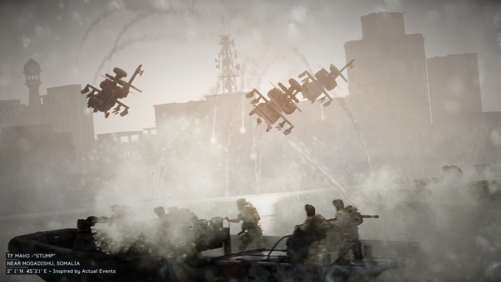
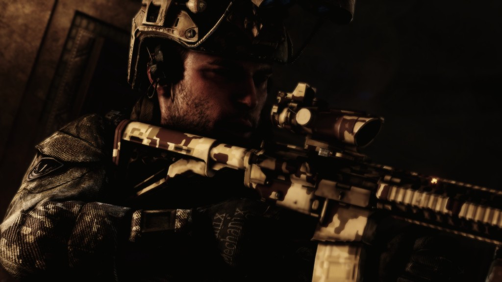
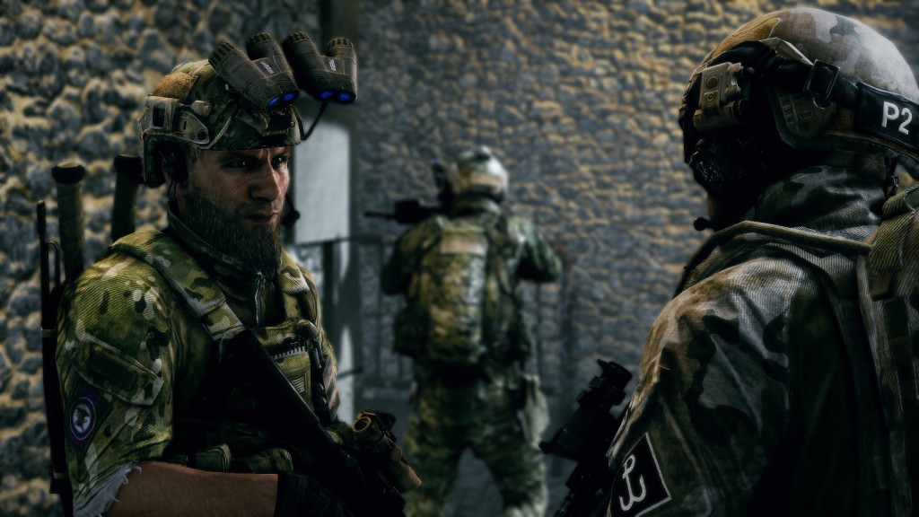
I ended up pre-ordering Medal of Honor: Warfighter after enjoying the previous game so much, and, as it so happened, ended up playing this year’s Medal of Honor title during this year’s Uni study period (the second one). Warfighter isn’t the first game in recent times that’s been almost universally panned (see also: Resident Evil 6), and at first, I couldn’t figure out why. I mean, Warfighter is as much a game as any of these other titles; it has a plot, which is played out via interactive gameplay and the occasional cut-scene. Isn’t that what a game is? And yet, Warfighter was receiving scores which suggested it was nothing more than exceptionally mediocre — nothing spectacular in terms of breakthrough gameplay, storyline or pacing, but just… average.

But… why?

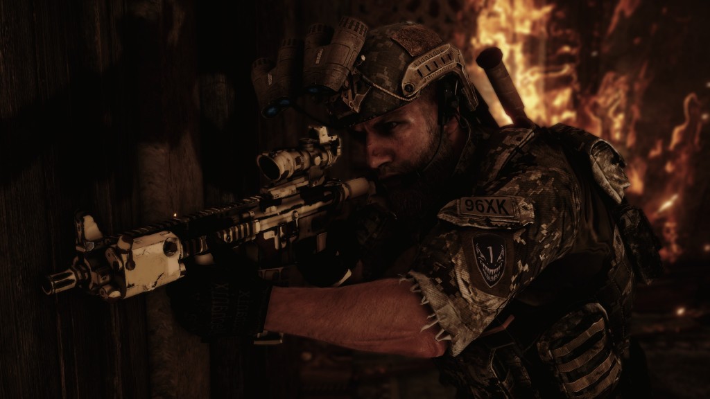
Warfighter is the story of Preacher, a Tier One operator who’s been through hell and back. He’s been through the thick of it in the past, but in Warfighter, Preacher starts out as someone who’s just on the sidelines. You learn that Tom — Preacher — has taken a leave of absence from his usual duties in order to fix his marriage, and meanwhile, something big is happening elsewhere in the world. By playing over some of Preacher’s previous missions, you learn that some of these things might be connected. Then, suddenly, boom — a train blows up in Madrid, the very train and platform where you’re supposed to be meeting your wife and kid. You wake up in hospital, where your former CO tells you your wife and kid are safe, that they missed their train. But that’s not all: things are going down, and others you used to know are there trying to clean up the mess, find the culprits, and get to the source.

What follows is your story of how you’re assigned to an entirely new Task Force, Task Force Blackbird, in order to find out who the source of these attacks is. First you’re looking for P.E.T.N., the explosive compound that you encountered during your very first mission in Warfighter, then you’re looking for where it came from, tracing the source all back to a certain Sheik, and then even further still, to a mysterious Cleric.

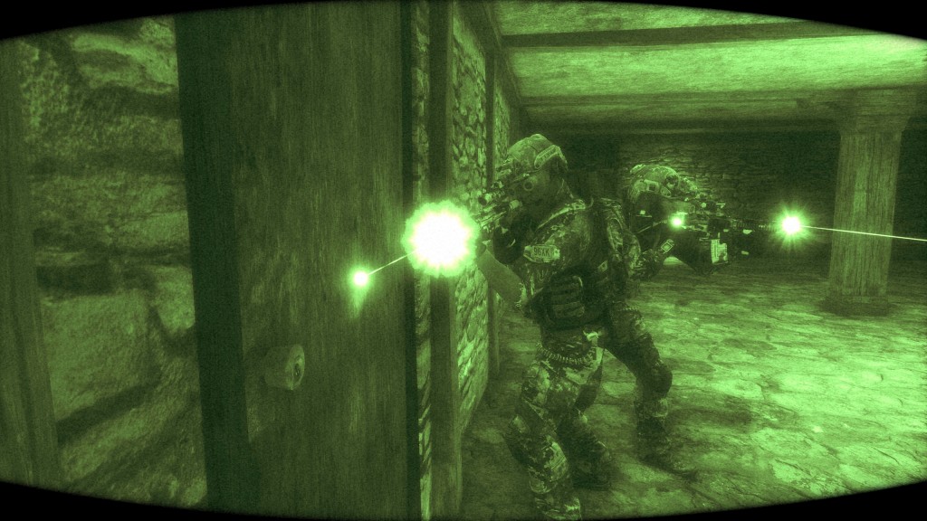
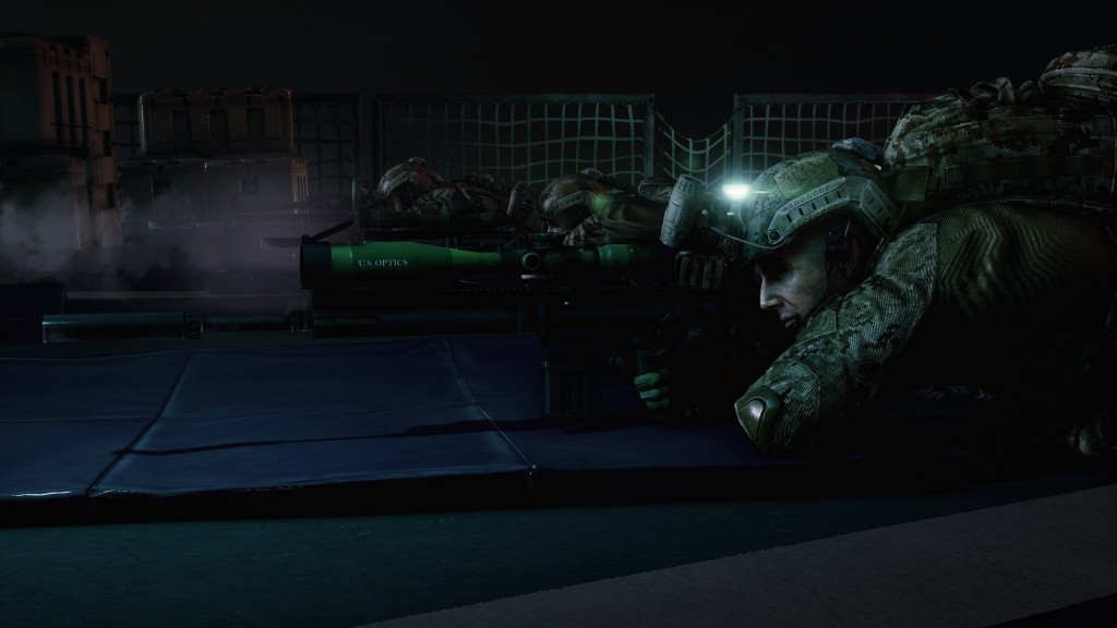
Along the way, you’ll eliminate enemies from a helo in the sky, breach through numerous doors in a variety of different ways, participate in a co-ordinated sniper strike on targets in a hostage scenario, and, perhaps my favourite of all, drive like a madman through the streets of Dubai, either in pursuit of a target, or in an attempt to evade pursuing forces.

Don’t get me wrong, Warfighter is just about as linear as they come. You play through the missions in the order as dictated by the developers. There’s no decisions to be made here, only enemies begging for a bullet in their skull. At the heart of it, maybe that’s the issue here: Warfighter is a game with a single-player campaign that doesn’t let you make decisions, that doesn’t put you in control. You don’t get to decide whether people live or die, you don’t get to call the shots.

“If I die, give this to my wife. She’s already got everything else.”

But, I mean, isn’t that kind of the point? If you’re expecting to make decisions in a game that’s all about what the developers want to show you, aren’t you expecting too much? Single player campaigns in first person shooters are all about telling a story, and if you’re not coming along for the ride — beautiful scenery, on-rails shooting galleries, and all — then you’re playing the wrong game. Because if the developers of the game wanted you to make decisions, if they wanted  you to be in control, wouldn’t they have put those kinds of elements into the game to begin with?

Honestly, this isn’t the first time we’ve seen this kind of game. Warfighter features un-skippable cut-scenes, and you know what other game does? The Walking Dead. Like Warfighter, The Walking Dead features un-skippable cut-scenes, of which there are many. And even though The Walking Dead is perhaps a game where you’ll make some seriously hard decisions, it’s also a game that features the illusion of choice. But again, why is any of this surprising, when it should be the complete opposite? Games that tell narratives (however poor said narrative might be) via their single-player campaigns aren’t exactly new, just ask any of the Call of Duty series, the Battlefields, or the somewhat newcomers, the Medal of Honor games (2010 game onwards, that is).

If it’s different you want, then it’s different you’ll get: Spec Ops: The Line is another game that I’ve written about recently, and that shares a lot in common with Warfighter. Spec Ops and Warfighter are both games that, on the surface, look extremely similar. They both set the scene for war, explaining to those who haven’t been in the mix what war is like. They’re both games that feature linear gameplay, fighting enemy after enemy, corridor after corridor. But where Spec Ops takes things to their extreme by evolving the protagonists into something resembling nothing like themselves, Warfighter takes the well-worn path. Warfighter forces you to take the shot, Spec Ops laughs at you for not doing so. By comparison with Warfighter, it’s easy to see why Spec Ops has been so widely praised.

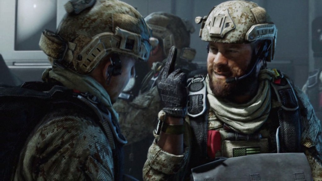
After my first play through of Warfighter, I wasn’t sure if I liked it as much as the previous game. I wasn’t even sure what the plot was even about, or why some of the cut-scenes weren’t rendered in the game engine, but rather, as some kind of quasi-movie scenes with actors that looked like characters out of a video game. But then, around halfway though my second play-through, I realised it was more than that, that the non-rendered cut-scenes served to separate the story from the gameplay. It was then it started to click: the story wasn’t all over the place any more and actually made sense, and I felt that I had a real sense of purpose during the game, that I was doing something that had a real impact on things.

I don’t necessarily agree that Warfighter deserves the scores that it gets, but I can see where the critics are coming from. Warfighter isn’t a mind-blowing game in any respect, but it does tell a story, and it does feature some nice — if extremely linear — gameplay. There are the odd enjoyable parts, such as the epic car chase scenes, but it does lack what I consider essential to any first-person shooter: a black-in, black-out sniper mission. Just thinking about that snow level (“Evasion”, if you’re playing Spec Ops) in the second Modern Warfare is enough to send me to my happy place.

Have you seen the movie Act of Valor? Warfighter is a lot like that. So like that, in fact, it’s almost as if Danger Close took Act of Valor and made a game out of it. Both Act of Valor and Warfighter had real-life SEALs onboard as consultants, and it shows — the game and movie are uncannily similar.

At the end of the day, if Warfighter set out to tell us about the heroes that go into battle against enemies, get shot at, beaten up, and then get back up and ask for more, than it succeeded. If Warfighter set out to tell us about the sacrifices these people make every day, then it succeeded in every possible way. It’s people like Preacher, Voodoo, Mother, and Rabbit that make gamers like us realise that all of what we’re seeing on screen is inescapably real for a select few.

And for that, I thank them.