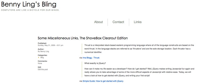
New theme, huh? Looks like [redacted].
So… Hopefully you’ve noticed the new theme by now.
If you haven’t, I have no idea what you’re doing here at this very second. You do realise that you’re on the internet, yeah? :S
I hated the old theme for a number of reasons –
- Horribly commented code.
One of my pet peeves has to be programmers (web or otherwise) who don’t follow good programming practices. In Satiorii’s case, it wasn’t just lack of comments – just a lack of readability in general. Ugh. - Sidebars at the BOTTOM of the page.
Uh, hello? Sidebars at the BOTTOM of the page? That’s just not cool – it might have been had you included links to jump down quickly, but in any case, sidebar widgets looked like they had been hacked together, and ugly as hell – misalignment, horrible formatting, etc.. 🙁 - No search.
See 2. Because search was so horrible, it wasn’t even worth using.
The previous theme – you could clearly tell it wasn’t designed to be modified. Plus it didn’t seem to be made by someone who understood how wordpress works – at least, not in the traditional blogging sense.
However, it wasn’t all bad – I chose to look past it’s shortcomings to focus on the good, because that’s the kind of guy I am. 😀
I did like elements of it, otherwise it wouldn’t have stayed as long as it did – particularly the awesome header links that showed off my pages:
 They’re quite nice – I love it how it placed those things front and centre, exactly where they should be.
Another thing I quite liked was the awesome typography of the blog name and sub-heading – under OSX, it just looked awesome. However, under Windows it was a different story – it seemed to be borked for most people anyway (or maybe just Chris). Maybe it’s how the two OSs render fonts, or how the anti-aliasing was waaaaay nicer on OSX, or something.
Anyway, I hope you like the new theme. It’s (the somewhat popular) Grid Focus, by Derek of 5thirtyone.com – if you have a chance, head over to that site to check out more themes. I’m even thinking of using The Unstandard theme for the Radi8 website… Oops, probably shouldn’t have leaked that 😉