Breakfast, Lunch, and Dinner with Android — Part Deux
In my previous post in the series, I detailed a few of the more user-facing things about Android, like app management, music syncing, and so on. In this post, I intend to talk more about some of the finer points of things like text selection, general usability, and finally wrap it up at the end with a few choice sentences about Android as a whole and how it compares to other mobile platforms. If the previous post was about a 3 (not quite computer illiterate and yet not quite your average nerd) on the Benny Ling official scale of nerdery, this post is about a 6 or a 7 (getting up there). Not to mention it’s fairly long… You have been warned!
You want to talk about fragmentation? Okay, let’s talk about fragmentation. Fragmentation isn’t an issue. Geeks like us might like to harp on the fact that everything (apps-wise) doesn’t run on, everything (hardware-wise), or that some apps are restricted to certain regions, or that different versions run on different devices, but the fact of the matter is, fragmentation isn’t an issue for most end users. I say “most”, because if you’re one of the unlucky few who has chosen either the cheapest Android phone you could find, or somehow gotten stuck with a manufacturer notorious for releasing updates very slowly, or even worse, not at all, then, then, fragmentation might be an issue. You can hardly blame Google for your fragmentation issues though, as it’s up to manufacturers to release updates for their phones, which also makes it super-easy for them to drop support in way of software updates for a particular phone. Exactly why I would only ever buy an Android phone either from the Nexus series (as you’re guaranteed software updates, it being the flagship Android phone at any given time)), or from HTC, or any of the other big players (Samsung just manages to sneak in here) — any other manufacturer is a crapshoot. I mean, sure you can put the latest ROM or whatever from XDA Developers on your Motorola Milestone, but do you really want to learn about bootloaders, custom restore images, and all that kind of stuff? Perhaps if you’re a geek, otherwise, probably not.
First seen in iOS, there’s a rather nice visual feedback effect to let you know when you have reached the end of a long list, or scrolled to the bottom of a webpage. The UI “bounces” to let you know there’s no more content, the scrollbar appears for a second to do the same, and you can go about your merry business. Android 2.3 brings a similar sort of effect, only instead of a UI bounce, you see a nice flash or orange whenever you reach the end of a scrollable section. It’s pretty nicely done — as you drag more and more away from the edge, you get more and more visual feedback (but only the very edge is tinted with orange, the rest is a semi-transparent white that builds upon the orange effect).
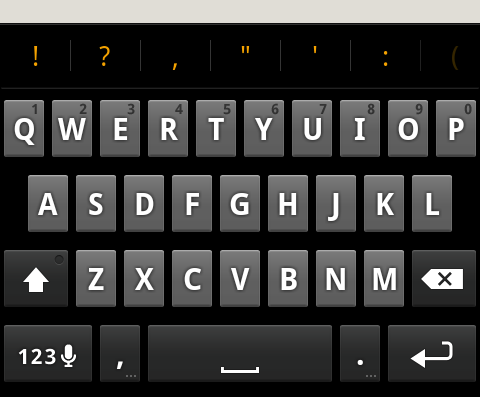
The funny thing is, I can only think of the Windows Phone 7 accent colour whenever I see these orange flashes. Orange is a good colour choice as it manages to stand out against pretty much everything, but it would have been nice if we had a choice of colours to choose from; I’m guessing that their particular implementation of this kinda of visual feedback means that basically any colour will be visible against the background. As it stands, the orange is used lots of other places, too — like when the spacebar can autocorrect a word for you, there’s a orange line that appears on it (more on text entry a little later), and even punctuation keys and suggested words use this orange colour. It’s not bad, but it could have been better.
While we’re on the subject of auto-correction and the like, I guess now is as good a time as any to talk about text entry and manipulation on Android. For starters, the software keyboard is just passable. Even a month on, I still can’t type as fast on it as I can on an iOS keyboard (granted, I am far more familiar with the iOS keyboard than I am with the Android one). This is either a testament to how shocking my typing skills actually are, or how brilliant the autocorrect in iOS actually is, but in terms of smartphone software keyboards, iOS is at the top of the stack, followed by WP7, then Android. The WP7 keyboard is surprisingly good compared to the Android one1; it’s not great, but I do like how the top row of keys (the QWERTY row) brings up numbers when you tap-and-hold. It’s a nice touch, and means you don’t have to switch to the symbols keyboard if you’re just typing one number.
One other thing to note about this tap-and-hold behaviour is that the letter or punctuation will automatically select a common alternative for you. What this means is you don’t have to slide your finger across to the right accent or alternative character (like you have to do on iOS), instead you can just lift your finger up and the alternative character will be the one input into your text field. Example: switch to the symbols keyboard on Android. Tap and hold the dash key. Appreciate how the Android keyboard automatically selects an em-dash for you (as denoted by the orange outline). Release finger. On iOS, the same steps would be: switch to the symbols keyboard. Tap and hold on the dash key. Notice how four options are presented, and the current key is selected by default. Slide your finger across to the em-dash, highlighting it. Release. See the difference?
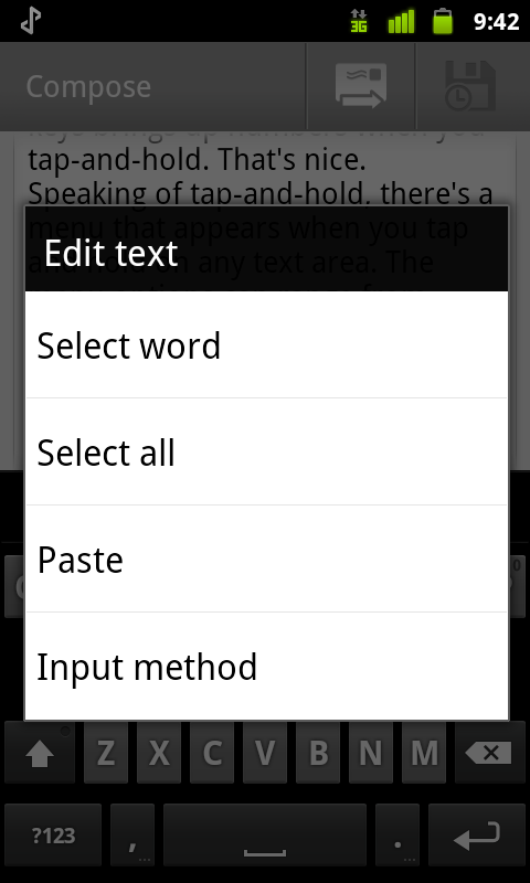
Speaking of tap-and-hold, there’s an all-encompassing menu that appears when you tap and hold on any text area. The menu options contain choices like select text, copy and/or paste, as well as giving you the option to add a word to the custom dictionary. It feels like an unwieldy implementation just because of the limited number of options, like buying a BMW X5 when a medium sedan would have done the job just nicely. The Android method works, but the iOS method of simply popping up a much smaller menu works much better, in my opinion.
The auto-complete engine works well enough, even if it is a little apostrophe-agnostic. Seriously, if iOS is a little apostrophe-happy by putting apostrophes everywhere, Android is just downright discriminatory — its/it’s is the main culprit2, but I’ve seen a few common contractions get missed on occasion (theres/there’s is also one that gets missed relatively frequently). It’s not a deal breaker as most of the time the auto-correct engine makes good use of the suggestions bar above the keyboard, allowing you to scroll left and right to select the word that you want; I find that I mostly use it when I’ve typed enough of a word to have it recognised, but can’t be bothered typing any more, so I just tap on one of the suggestions which automatically fills in the rest. Also, there’s an orange bar on the space bar to let you know that when you press the space bar, your current word will be auto-corrected to whatever is BOLD in the suggestions bar; in this case, “ftagment” will be auto-corrected to fragments.
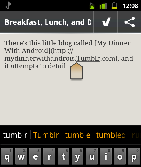
Nay, my biggest gripe about text manipulation is placing the text cursor. IOS definitely has the best implementation here: hold down on text and a little loupe tool appears above your finger, showing you exactly where you’ll be placing the cursor. Windows Phone 7 uses a similar action, but without the loupe/magnification tool; instead, you move the enlarged text cursor that follows your finger as you move it through the text. Android, however, uses the worst possible way of them all: you can’t tap and hold on the text, because that brings up the select/cut/copy/paste menu! Instead, you have to do the super-inaccurate tap-and-peck, which means you’re basically just guessing most of the time, and at best, you’ll have to tap a few times to get the cursor where you want it to be. Thankfully, a little draggable icon does appear the first time you peck at the screen to allow you to fine-tune your cursor placement, otherwise cursor placement would be a nightmare. Easily one of the worst aspects of text manipulation, as selection works with handles (you can then tap the selected portions of text to bring up the cut/copy/paste menu, which is handy), although there’s no iOS-like loupe assistance here), just like it does on iOS and WP7, and every other mobile platform you care to name.
Overall, text input and manipulation is fine, but could definitely do with some improvements here and there. There’s realistically nothing I would take from Android to put into iOS, although that suggestions bar is mighty appealing at times.
Getting away from text-input nerdery for a second, people say widgets on the homescreen is one of the best things about Android, and they’re somewhat right. As a whole, widgets are great for accessing things from your homescreen that can’t easily be accessed elsewhere. Yeah, it’s great to have shortcuts for lots of things, but I can’t help but wonder why I need those shortcuts in the first place. On iOS or even WP7, things are never more than a few taps away — compare that with Android, where things can be quite a few taps away; widgets solves those issues, for sure, but the best widgets are the ones that dynamically update with relevant information, like your Google Reader unread count, or the latest weather update, or where you can check-in on Foursquare. Better still are the widgets that allow you to do things right from your home screens, like read Facebook updates from friends, or even read, reply to, and compose new SMS messages, right from the home screen.
On iOS, apps can use a custom URL scheme for resources or actions. For example, my app could take the user directly to their timeline in Tweetbot by using a URL of tweetbot://timeline, as detailed in the (Tweetbot custom URL scheme)[http://tapbots.com/blog/development/tweetbot-url-scheme] post. It’s very handy, and the x-callback-url implementation is even cooler (allowing you to go back to the app from where you came from). Android doesn’t have anything like this. Okay, that’s not entirely true — it somewhat does, only they’re called intents and they’re only kinda similar. Developers have to register URL intents so that their app will open if a particular URL schema is loaded, otherwise any (normal) URL is simply loaded by the standard browser3.
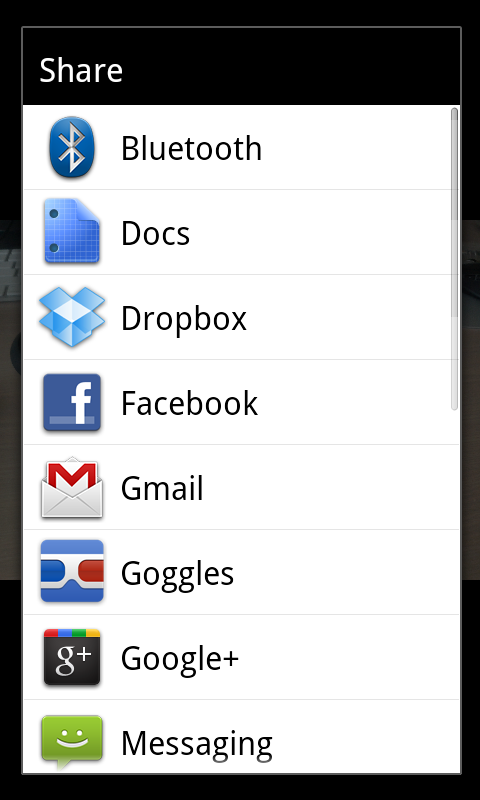
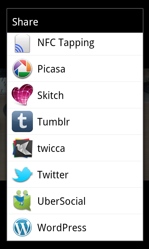
These intents are the Android solution to communication between apps, and can be presented to the user as a share menu (which affords users the capability to use content between all applications that support that kind of content, be it an image, text file, PDF document, or similar). Yes, there’s a similar sort of thing in iOS where apps can share information (using the “Open In…” button on a PDF file in Mail gives you a menu that shows you all the apps you have installed which can deal with PDF files), but the Share menu buttons that I came into contact with on Android were much more populated. It’s one of the best features of Android; I’m guessing that there is less of an “app sandbox” like there is on iOS.
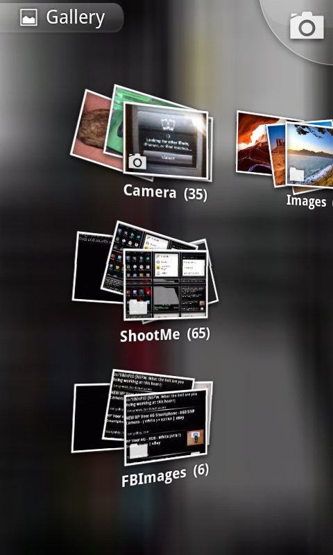
Remember how I was talking about needless UI? If you have an Android phone, check out the Gallery app. It’s a prime example of stuff that looks cool for the sake of cool, rather than functional. I mean, why does a gallery app need to use the accelorometer to tilt the grid of photos? And I get that using two fingers to expand out a stack of photos is cool on an iPad, but the iPad has a 10 inch display! The Nexus S is a minuscule 4 inches by comparison; you can only just get two fingers on there in the first place, and you can pretty much forget about actually looking at your photos. In terms of usability, the Gallery app is also terrible — why on earth do I have to wait for thumbnails to render, even on very recent hardware? And it’s not like I’m waiting 2 or 3 seconds, I’m waiting upwards of 10 seconds for all my thumbnails to be rendered in the grid view. I’ve never appreciated the responsiveness of the thumbnail grid view of the iOS Photos app more, and I now realise it makes far more sense to render the thumbnails much faster, and then render the individual photo. For the record, alternatives like QuickPic weren’t much better in the performance stakes, though they did do away with the plain terrible accelerometer-controlled tilt-able grid view.
IOS has nailed scrolling; scrolling on iOS is the smoothest, most lag-free experience I have ever encountered on any mobile platform. There have been quite a few improvements to scrolling on Android since the old days of 2.1, but it’s still nowhere near as good. It’s occasionally jerky at times when it really shouldn’t be, the momentum doesn’t feel as fluid as iOS, and it’s never quite as responsive as it should be. I’ll stop being so negative for a moment and tell you about something about Android that is actually somewhat appealing, then I’ll wrap it up with some final thoughts on the platform.
By far and away, the most appealing part of Android is the customisability. It’s not hard to see why Android is really popular among PC users, tweakers, and overclockers. There’s basically no limit on the sorts of things you can change; don’t like the keyboard? Swap it out. It’s a reasonably well known fact HTC handsets, for example, have their own spin on the standard Android keyboard. No orange accents here, thank-you very much — all white, all class. I spent a little time with the much-improved Swype keyboard as well (I got into the beta last year — right after I sold my Desire, haha), and that’s the same as ever — a really interesting way to enter text. Spelling out words can seem more tedious at times because you might be doing a lot of back and forth between letters, not to mention you can only use one finger at a time, but overall it’s not bad.
I’ve said that the stock Android Launcher is pretty bland, so after tolerating it for a few days I switched to the almost universally-praised Launcher Pro. The difference is staggering. Not only am I able to configure every option imaginable, but also what icons and shortcuts I can use in my “dock” (the bottom five icons), as well as configure how many docks, whether use endless scrolling, and what the “swipe up” action does (I had mine to compose a new tweet if a swiped up over my Twitter client icon, or to compose a new SMS if I did the same over the SMS icon). Launcher Pro is amazing, and I didn’t even have to try any other Launcher alternatives. It will even attempt to emulate the stock Launcher 3D app drawer effect — it’s truly amazing. Launcher Pro also comes with its own set of widgets, as well as stylised icons for the dock icons, rounding out the package nicely. The premium version of the app also adds the nice ability to resize any widget you currently have, so you can fit even more (or less) widgets onto the screen at a time. This is the kind of functionality you would only see from jailbreak-type apps on iOS, so it is somewhat intriguing to see this on Android.
But wait, there’s more! For some strange reason, the version of the i9020A I have has a crippled baseband which means that upload speeds over 3G are capped at around 40KB/s. It was never an issue in daily usage, but dammit man, this is Android. After rooting my phone (essentially the Android equivalent of jailbreaking), I installed an entirely new radio baseband — one still designed for the Nexus S, of course, but one without the upload cap — and I honestly believe this is one of the few times fragmentation has actually helped. Sheer choice of models, tiny, minuscule differences between them, meant that they were similar enough to still be compatible, but different enough to alleviate an issue I was experiencing with my particular model. That’s, ladies and gentlemen, is the best kind of fragmentation.4
I mean, I flashed a radio while sitting in a lecture at one point. Sure, I had put the done the research and put the correct files on my SD card beforehand, but I flashed a radio. During a lecture. If that’s not customisability, I don’t know what is. For those truly serious about tweaking their phone to within an inch of its life, the process of rooting opens up a whole new world of possibilities. More accurately, it’s the combination of unlocking the bootloader (yet another advantage of the Nexus S5) and rooting that gives you the greatest freedom on Android, freedom to install everything from a completely different ROM (like replacing the whole operating system — you’re still running Android, just a highly customised, highly optimised version of it), to even replacing the kernel to add more features or extend battery life, the possibilities are endless for those serious enough to go the whole hog, so to speak.
Which brings us, dear reader, to my penultimate point about Android in general. There’s an old saying that goes something along the lines of “Linux is only free if your time is worthless”, and it applies to Android as well. Things like Launcher Pro are easy to use because they don’t require you to perform any serious modifications to your phone, but you’ll have to go through the whole process of rooting (including unlocking your bootloader, and so on) if you want to do something as simple as taking screenshots.
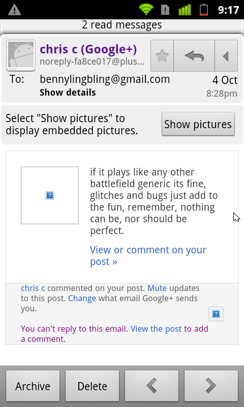
Don’t even get me started on how difficult it is to select text in an email. It’s not just a tap-and-hold like it is on iOS, it’s a “tap menu, then more, then select text”– which then gives you a cursor, of all things. On a mobile device! If there was ever a definition of terrible usability, this would be it. Did anyone even think about how people would use such a common feature as selecting text from within an email? And as much as my inner geek enjoys the ability to tweak every setting and change every preference, I cant help but ask myself: custom ROMs and kernels are great and all, but why is battery life so shockingly bad in the first place? Why doesn’t scrolling seem as smooth as it does on iOS? It’s these kinds of questions that are Android’s undoing. And that’s the thing; why are things that are supposed to be easy so darn hard? I mean, it’s great that things are so customisable, but when does customisability become less “changing things to suit personal taste” and more “swapping entire components about because the original is inexplicably flawed”?
I get that people change things so they can add features, I really do. I even entertained the notion of swapping out my kernel and ROM in order to load one that used a feature called BLN, which would allow me to use the capacitive button lights as a notification LED-type thing. What I have an issue with is when changes are done because the original just isn’t good enough, or the original is too terrible to even consider6. Widgets are great, but why are shortcut widgets needed in the first place? For convenient access to items, or for convenient access to items which are otherwise buried under an entire menu hierarchy?
Here’s a nice quote from the Dinner With Android guy7:
I’m sorry for the lack of posts as of late. To be honest, I’ve become complacent with Android. I honestly think that if there was iPhone-calibre hardware out there, I could stick with Android and be fairly happy.1 If only the ecosystem were a bit richer. If the end-to-end user experience were tighter. If iOS 5 wasn’t filling the gaps and leaping frogging them in other places. If only, if only, if only.
Truth be told, Android isn’t bad. My other post got one tiny piece of negative feedback about how it was a little too negative, so let’s correct that: Android, as a an operating system, isn’t bad. It’s genuinely not terrible, and I really mean that, there definitely are some appealing features that I would love to see in iOS. But, and this is a pretty big but, any platform is only as good as the sum of its parts, and Android just doesn’t have the same amount of polish that iOS does, or even, dare I say, Windows Phone 7.
Android looks good from a number of different angles, don’t get me wrong, but it’s the little things. Things like a serious lack of consistencies between interfaces. Things like a serious lack of attention to detail in certain areas, things where things just don’t look right or work the way you would expect them to. When you push the menu button, you often don’t know what kind of menu options are going to pop up; you just press them in the hope that something nice happens, something that is exactly what you wanted to do with the app. Worse, you don’t even know whether you’ll get a single row of menu buttons, two rows, or perhaps even three rows. Sometimes, you don’t even know you can press the menu button, which is nothing but terrible feature discovery in my book. I’ve heard of the tap-and-hold being the feature du-jour of those looking for advanced options, but the menu button use in Android is just inconsistent. I’ve had very little experience with Android tablets, but the feeling is much the same. iOS on the iPad uses all the same UI and UX paradigms that the iPhone version does, and they’re genuinely two things which have a real sense of coherence; they both work the same way.
I used Android for a month. Almost two months. And almost every step of the way, I disliked various aspects. Yes, it’s about the apps — but when apps don’t even obey the silent mode, choosing to make noise when vibrate-only mode is selected, that’s when I decide I didn’t like my dinner with Android after all.
This post part of Blogtober 2011, just a little thing of mine where I (attempt to) post something up on my blog every day in October 2011.-
Perhaps it has something to do with the height of the individual keys — the keys on Android are tiny bit shorter than keys on iOS or Android, but maybe it’s those few pixels that makes all the difference.
-
Yes, I’m aware that its and it’s are two different words, my point is that iOS is always more than happy to correct its to it’s, while Android almost never does. Interesting contrast between the two, is all.
-
For the record, what I was doing when doing that Foursquare checkin thing via NFC was just encoding an ordinary URL like http://m.foursquare.com/venue/92720472 to a NFC chip. To my surprise, an ordinary http URL loaded in the Foursquare app, as opposed to the browser. I haven’t seen what determines this behaviour, as encoding Twitter web URLs didn’t seem to do anything interesting (in that they didn’t open the Twitter app, just the normal browser).
-
The best kind of fragmentation: where you have a set of devices that are similar enough to be compatible with each other, yet have minor hardware or software differences in order to still be separate devices. It means that you can manufacture one case design for a number of different models, for example, or that you can swap out software components from one model into another.
-
Being a Nexus device, the Nexus S has one advantage when it comes to rooting: an easy-to-unlock bootloader. The bootloader is where the first part of the magic happens when you’re rooting or just installing a custom ROM. Without an unlocked bootloader you’re in a difficult position. No, the Nexus S doesn’t come with an unlocked bootloader, but it’s one command in fastboot to unlock it, which means you’re much better off than those HTC guys, who have to use exploits to unlock their bootloaders.
-
I am of course referring to those ROMs-which-must-not-be-named from certain manufacturers which-also-cannot-be-named. Hey Samsung — TouchWiz is a load of crapware, and anything else carriers add to it is totally unwelcome and just makes the experience worse. Also interesting to note: I’ve yet to see carrier-customisations which aren’t a load of crap.
-
Favourite post of his: Dual Wielding, for sure.
